Blog

  • Optimizing Knowledge Graph for B2B Brands


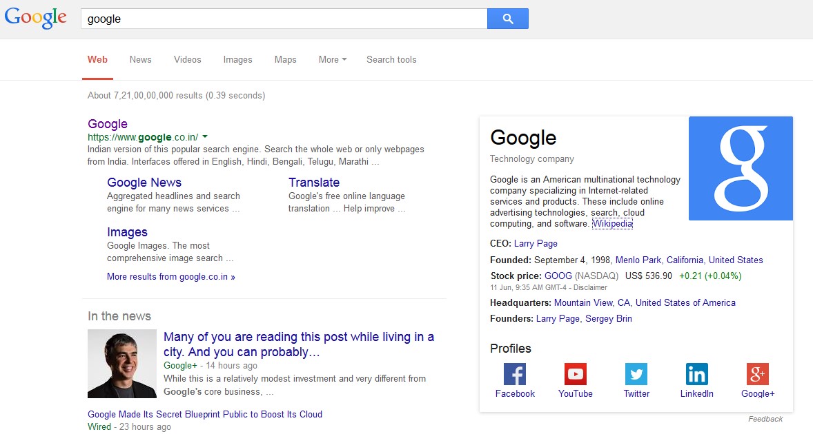
    Google’s Knowledge Graph showcases for a user structured and detailed information about a topic based on their search. The goal is that users would be able to use this information to resolve their query without having to navigate to other sites and assemble the information themselves.

    Marketers who understand the sources from which Knowledge Graph information is retrieved can highlight relevant information about their brand in ways best understood by Google crawlers and algorithms.

    google search results

    Components of a Brand’s Knowledge Graph:

    1. Logo: derived from the logo markup using JSON-LD
    2. Company Description: derived from the Wikipedia page of the brand (if there is no Wikipedia page this won’t appear)
    3. Profiles: derived from the social profile markup using JSON-LD

    How to Make your Brand Eligible for Google’s Knowledge Graph

    Markup the Site Using JSON-LD Syntax

    Google recommends JSON-LD because, unlike schema markup, JSON-LD doesn’t require the marketer/developer to interweave the structured data with the HTML displayed content.

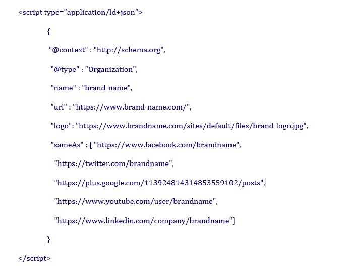
    The following code shows how to highlight a company logo to Google, and how to link the social profiles of the brand with the website:

    google knowledge graph

    To check if the markup is correct, use Google Structured Data Tester.

    The next time Google crawls the page, its indexing algorithms will process the profiles from your markup, making them eligible for use in search results. It can take up to a week to kick in.

    What you Need to Know About Organization Markup

    1. Place the JSON-LD markup code on the Home page of your brand
    2. Pages with markup should be allowed for search engines to index and follow
    3. For sites that have a verification process, Google only shows verified profiles
    4. Insert the SCRIPT block anywhere on the page — either the head or body of the page


  • Fool-proofing Fat Fingers


    Updates to address accidental ad clicks

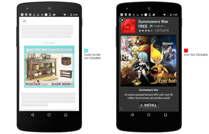
    Making accidental ad clicks on your mobile phone just got harder. Google has announced several new changes to reduce accidental clicks on mobile display ads, addressing fat finger ad clicks on mobile where a swipe for scrolling gets treated like a ‘tap’ to open the advertisement.

    1. Having identified the border area (see above, left) as particularly prone to accidental clicks during scrolling, Google now makes certain that taps close to the edge of an image ad won’t register as clicks.
    2. For in-app install ads and interstitial ads (see above, right) users won’t be able to click on the app icon because the close button is overlaid on that image. Users will need to click the call-to-action button.
    3. Finally, ads will only become clickable when they’ve been onscreen for “a short period of time”. This gives users time to scan through the display ad.

    If you are running Google display ads, you might want to note the timing of these changes when reporting clicks and click-through rates.

    On the Facebook Front

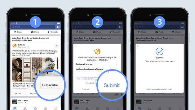
    Facebook announced this week that it’s testing a lead ad unit to make filling out forms on mobile devices easier for individuals,  and easier for businesses to gather that data. The new ad format auto populates contact information when the user is signed into Facebook.

    Facebook form filling to get easier

    As Facebook explained in a post on its business blog:

    “The lead ads that we’re testing use a native signup flow within Facebook. This helps avoid a lot of the pain points usually associated with filling out forms, like having to leave one app and start a form in another app, and having to enter all of their information from scratch. Just a few taps and people are done.

    “Like our other ad formats, we’ve built this ad type with privacy in mind. People can edit their contact information, and information isn’t sent to the business until a person clicks the ‘submit’ button. Advertisers may only use this information in accordance with their privacy policies, which we make available in the lead ad before people click submit. Advertisers are also restricted from re-selling lead information to third parties.”

  • Best of the Week | Crafting An Effective Call To Action, and much more…

    This week’s hot news, events and videos from the online marketing and social media world.
    Crafting An Effective Call To Action
    From the Position² Blog This Week:
    Crafting An Effective Call To Action
    Highly successful websites, landing pages, email campaigns and PPC ads all have an effective call to action in common. That’s a fact. Read this blog for a few best practices to help you improve on your CTA efforts.
    Top Stories this Week: Social Media
    Top Stories this Week: SEO, PPC and Digital Media
    SMX Advanced 2015 - AMA with Google Search Best of the Week Video
    One of the highlights of SMX Advanced was the AMA session with Webmaster Trends Analyst, Gary Illyes. Watch on as Danny Sullivan of Search Engine Land asks the hard hitting questions about Google’s latest developments!
    Persona Based Lead Scoring: The Mystery and the Method
    Download this White Paper and learn:


    • Classify leads based on behavior and demographic details
    • Develop a consistent methodology to proffer quality leads to sales
    • Employ data integrity and tracking
    • Deploy marketing automation to improve efficiency and cut costs.?

    Download the complimentary persona Based Lead Scoring White Paper now

    Lead_scoring_Whitepaper
    If you are reading this blog post via a RSS reader, please click here to subscribe.
  • Crafting An Effective Call To Action


    Highly successful websites, landing pages, email campaigns and PPC ads all have an effective call to action in common. That’s a fact. It’s the CTA (call to action) button on your landing page that guides the users to goal conversion.  An effective CTA urges visitors to buy, subscribe, register, apply, download, vote, share, play and learn more.

    Here are a few best practices to help you improve on your CTA efforts.

    1. The CTA has to be aligned to the campaign objective

    Whether you are running a PPC campaign or an email marketing campaign, the CTA has to be perfectly aligned to your core objective.  Using the right text makes all the difference.

    One study showed that using first person increased conversion rates by 90%.  A simple “My free trial“ instead of “Your free trial” made all the difference.

    Use action oriented text, not the usual “Download here” or “Get Started Here”. If it’s an invitation to visit a video page, limit the CTA to Watch Now, not Learn More. If it’s a loan application, use Apply Now.

    2. It pays to tell them—clearly & loudly!

    Not every visitor to your landing page will a button presser be.  Those inclined to press the button need a clear cut call to action telling them to “just do it”.  The study quoted above found that simply adding “now” to the copy resulted in a nearly 30% improvement in conversion rates. “Now” – Buy Now. Subscribe Now.

    A good example of using “Now” in the CTA:

    CTA

    3. Make choices clear

    Emailer buttons are meant to be clicked.  So it is imperative that CTAs are clear and compulsive.  Do not clutter the copy with a maze of options. Simply show the way. If there are multiple objectives and communication assets, create more than one campaign or landing page, each with its own CTA.

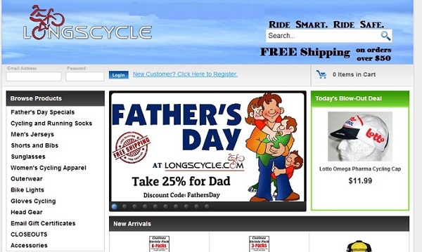
    The perfect example of what not to do to a customer:
    CTA2


    4. Value delivery or click triggers

    Not many visitors will click on a PPC ad or banner stating the obvious or obviously exaggerating “facts”.  A CTA like Try It Free For 7 Days will always sound more credible than You Need To Try It To Believe It.  Show value by stating facts and focusing on user benefits. A confident visitor will take immediate action, so encourage that. Additional information — called a click trigger — provided near the clickable CTA button or text can be beneficial. Click triggers include:

    • Customer testimonials
    • Product benefits
    • Recognition
    • Short term incentives

    5. Placing it right and making it visible

    Websites, landing pages and e-mailers have different ways of presenting calls to action. Many effective communication assets present CTAs above the fold where almost 80% of visitors spend time. Color and design are of equal importance.  Maximize the use of white space around the button to highlight it. Use contrast and flow to good effect.

    Good button design is imperative. “In your face design” is not to anyone’s advantage, depending on the product and target audience. Placement and prominence are the keys to high call to action conversion rates. The bottom line is engagement.

    An example of flow, design and contrast:

    CTA3

    6. The look and feel matters

    Design a call to action button that’s both interesting and inviting. It should stand out and grab the visitor’s attention. Try some relevant embellishments (like an arrow pointing to the button) or animations (CTA and click trigger on the same button). More breathing space and button text in large fonts attract attention. Never forget to place alt tags for email buttons, or convert them into complete text, so the call to action never gets missed even if the images don’t load.

    CTA4

    Last but not least, run tests to understand what works or does not.  Do A/B testing and retain what works.

    Here’s wishing that your CTAs keep converting! If you want to know how we integrate calls to action to create high converting marketing assets at Position2, drop us a line.
    And if you have any new CTA ideas, please share them here for the benefit of our readers.
  • Google Trends: A Real Time Window On The World

    Google-trends

    Google Trends. It’s all about real-time minute-by-minute data on trending searches. On average Google processes over 40,000 search queries every second. That’s over 3.5 billion searches per day and 1.2 trillion searches per year worldwide. Google’s recent changes ensure that users get:

    1. Real-time data
    2. Story-centric Homepage
    3. Better coverage for deeper insights
    4. Curated data sets

    Real-Time Data

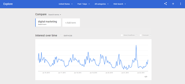
    Marketers can explore minute-by-minute, real-time data behind the billions of searches that take place on Google every month. Go to Google Trends and explore this data by selecting any time range in the last week from the date picker.

    Story-Centric Homepage

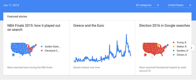
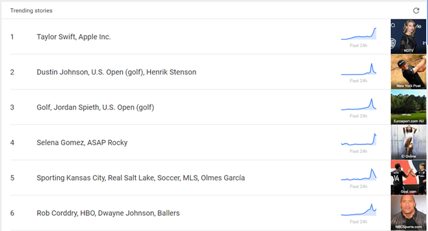
    Google now combines Search with YouTube and Google News to better understand what topics and stories are trending across the web right now. The Google Trends homepage ranks lists of trending stories that are gaining traction across Google, real-time.

    Trending-stories

    Better coverage for deeper insights

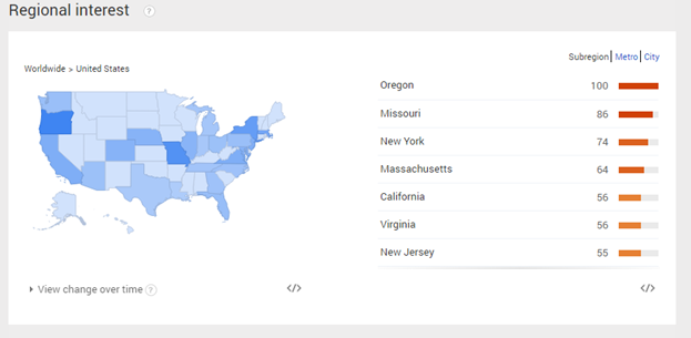
    Google has increased the breadth and coverage of Google Trends data to allow for in-depth research on more niche topics in smaller geographies.

    trends-data

    regional-interest

    Curated data sets

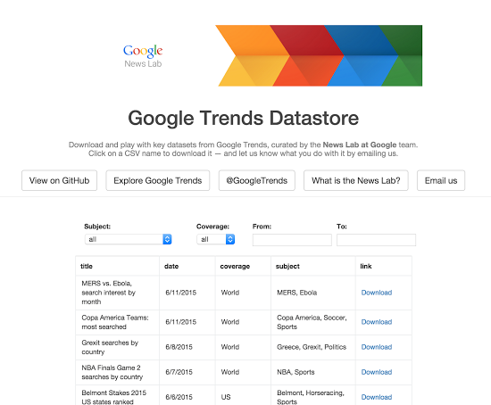
    Google News Lab team examines trending topics every day to figure out which pieces of data brings to life a headline or story. This helps marketers understand what’s likely to work when telling stories using data.

    google-trends-datastore

  • Best of the Week | Should You Go Mobile First Or Mobile Only, and much more…

    This week’s hot news, events and videos from the online marketing and social media world.
    Should You Go Mobile First Or Mobile Only?
    From the Position² Blog This Week:
    Should You Go Mobile First Or Mobile Only?
    Last year mobile took over the internet. Industry projections for both the number of users and overall web users show that smartphones have overtaken the desktop for good. Should You Go Mobile First or Mobile Only? Read this blog to understand what it really means to go mobile.
    Top Stories this Week: Social Media
    Top Stories this Week: SEO, PPC and Digital Media
    Should You Go Mobile First Or Mobile Only? Best of the Week Video
    Check out this digital marketing bootcamp with Marketo’s Michael Berger for a deep dive into marketing automation and the tools you’ll need to make the evaluation process easier!
    White Paper: Increase Visibility for Your Content by 4x
    Today’s traditional SEO is inadequate: Ignite your search results by accelerating visibility in more places than ever before.Download this White Paper and learn:


    • SEO, why the way we know it is not enough
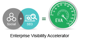
    • Introducing and implementing Enterprise Visibility Accelerator (EVA)
    • Using multi-channel tracking tools for effective monitoring
    • How EVA benefits businesses.

    Download the complimentary EVA White Paper now

    Enterprise Visibility Accelerator-EVA
    If you are reading this blog post via a RSS reader, please click here to subscribe.
  • Should You Go Mobile First Or Mobile Only?


    Flipkart, India’s answer to Amazon, bid adieu to its mobile website with the Big App Shopping Sale in March, 2015. From here on out, Flipkart shopping is all about the mobile app. Myntra, India’s foremost e-commerce fashion site, has shut down its mobile website, and may ditch browser-based shopping altogether. Such is the rising power of mobile.

    With e-commerce firms actively pushing consumers to their apps and leveraging attractive discounts and deals to encourage consumers to buy through the apps, having a mobile app in place is now all but essential. From Amazon’s Happiness Day sale in November 2014 to Myntra’s Binge Weekend Sale and Snapdeal’s App Fest in February 2015, the offers on mobile apps just keep on coming.

    “There is a business reason behind promoting apps,” says Mr. Rajiv Srivastsa, founder and chief operating officer of Urban Ladder. “It leads to higher conversion and engagement. If you build only an app platform, it is cheaper as you don’t have to invest in two-sets of codes – both mobile website and app.  However, in the long run, one has to engage the user enough, so she doesn’t uninstall the app.”

    Mobile App or Mobile Website for e-commerce Business

    Experience is the Key

    Though apps offer an attractive way for e-commerce players to interact with their consumers, it is neither easy nor advisable to force apps on customers. According to a study conducted by ICM Research in UK, a majority of customers prefer to interact with retailers through their mobile websites and only download an app if they are incentivized to do so, or if they are regular shoppers. And yet the same consumers are far more likely to complete transactions through the retailer’s mobile app than through the mobile website.

    “Going app-only makes sense if you can provide an experience not otherwise possible on the mobile web platform,” says Shamik Sharma, chief product and technology officer at Myntra.

    Consumer Experience on Mobile App

    Merits / Demerits of Mobile App

    There are crucial differences in the ways mobile websites and mobile apps help customers navigate and experience their shopping journeys. Mobile apps function a lot like mobile websites. They have certain operational and functional benefits and they have downsides as well. Customers can interact with the app 24/7 no matter where they may be. The IT advantage for business is having their own corner on a customer’s device. Mobile apps promote a customized experience because they work in the background, allowing e-retailers to collect user-specific data such as recurring purchases, duration of browsing, preferred platform to share information, geo-location and so on. The downside involves convincing customers it’s in their interest to install the app and give up permissions.

    Some businesses simply prefer both mobile websites and mobile apps. For example, India’s MakeMyTrip mobile site is an acquisition platform while the app is a loyalty and retention platform complementing its desktop presence. According to Pranav Basin, head of online products for Makemytrip.com, “The desktop plus mobile app is a great combo. They complement each other perfectly”. Ankit Khanna, Senior VP for product development at Snapdeal cautions, “We do not want to force consumers to download our app. If they want to browse first and buy later, we enable them to do that”.Website Vs. Mobile App – Position2 Blog

    While an app install “cost” is high, once you get the consumer on board the marketing cost could shrink.

    While mobile apps enable better targeting of customers, the major draw back is the extra step introduced into the shopping journey – at least the first time around. As one e-marketer pointed out, with e-commerce you click and buy. With an app, you click, you download and install, and then you buy.

  • Evolution of Mobile: The Future of Mobile SEO


    Expanding the theme, Evolution of Mobile SEO : Is Your Website Mobile Friendly?, we ask: Are You Ready for What’s Coming?

    Google is never likely to sit still. The company wants to enhance their competitiveness while giving users the best solutions. Here are a few tips on how you can gear up for the ever unfolding future:

    1. Getting the ‘Mobile Friendly’ Designation in Mobile SERPs has affected search rankings on smartphones. Unblocking CSS and JavaScript plays a vital part in nailing the Mobile Friendly designation, according to Google Webmaster. Googlebot needs to see your site like an average user. By always allowing Googlebot access to the JavaScript, CSS, and image files used by your website you achieve optimal rendering and indexing,
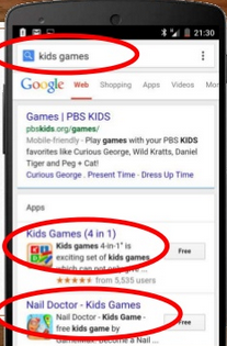
    2. Deep linking has become one of the key signals for positive web rankings and to drive traffic to the Apps. They appear in the Google SERP individually or as part of a mobile App Pack. An “App Pack” is a group of related apps that rank together for a given query. It’s shown together in a box separated from the inline organic search results.

    Mobile Search Results with App Packs

    Screenshot from Cindy Krum and Linkdex webinar

    1. Demystifying ASO: Keep your App Store Optimization title tags short and descriptive. It’s to your benefit to have exact match keywords in the title and description tag. There are advantages as well as disadvantages to having a mobile app rather than a web page. For queries that are almost similar to the app name, mobile websites get pushed down below the fold.
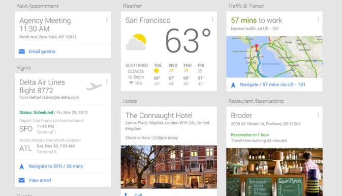
    2. Google NOW has evolved into the user’s personal knowledge graph. Users are adding data and increasing content to their big data mix with info cards as the most ideal and personalized result format for users. Google gives the right information at just the right time assisting you around the clock with relevant suggestions.

    Personalized Info Cards - Google NOW Google Products that affects Mobile SEO

    Image source

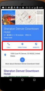
    1. Mobile Results going full screen on Page #1:Music info cards, hotel booking search, flight booking search, TV info cards, map queries, restaurants and menus, etc. take up the top fold of the search results.

    In this example, for a search query “hotels”, Sheraton Denver Downtown Hotel  takes up the first fold.

    Full Screen Mobile Search Results – Position2 Blog

    Image source

    1. Google avoids blue links or websites from showing above the fold on Mobile. Results that are likely to come up for search are Info cards, Answer boxes, Knowledge Graph results and other cards.

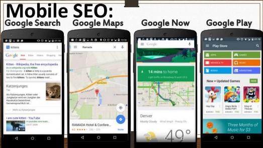
    Your task:  Optimize for mobile search and Google Now.  Apps, Images, Videos and Google+ for business need to be optimized for placement at the top of the Mobile search results.

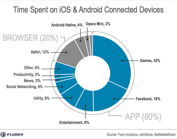
    1. App like sites, instead of mobile websites: The numbers speak. Users spent 80% of their time on Apps and 20% of their time on Website. Mobile App visits Vs. Website visits
    2. Personalized Info Cards are generated by different Apps: Google integrates with different Apps to generate info cards, for example adding transcripts and lyrics to videos and music, displaying them in answer boxes. Google makes these changes to deliver the best mobile experience for searchers, giving them exactly what they want at the right time.
  • Evolution of Mobile SEO: Is Your Website Mobile Friendly?

    Evolution of Mobile SEO

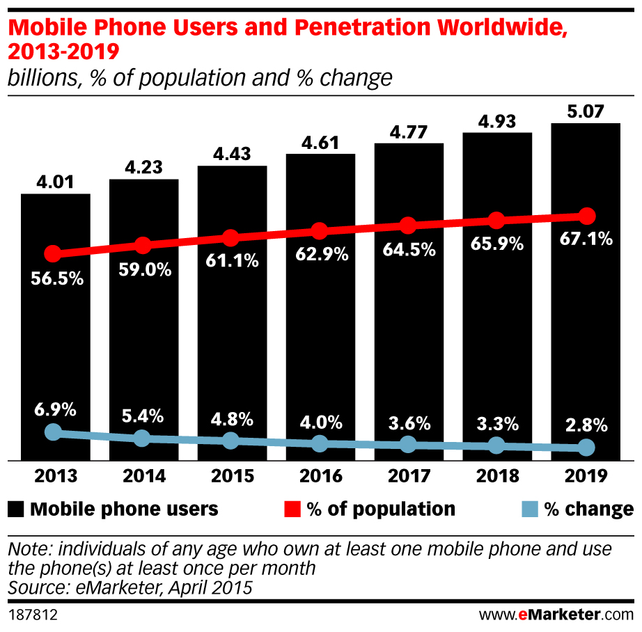
    With 4.43 billion individuals using mobile phones world wide — 1.84 billion of them smart phones –  and with half of all local searches carried out on mobile devices, it’s no wonder Google has become determined to deliver the best possible mobile user experience on search. With continuous algorithm updates the company’s message is clear: improve your mobile web development practices or suffer the consequences.

    Mobile Phone Users and Penetration Worldwide - 2013 -2019

    The April 21st Mobile-friendly Ranking Algorithm rollout – Mobbilegeddon —  has had a significant impact on mobile search results, with websites not quite mobile friendly dropping in rankings overnight.

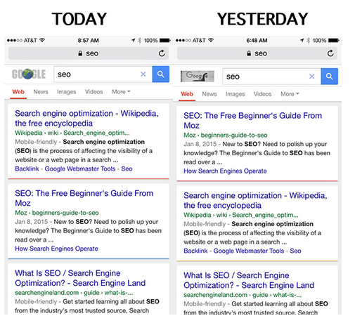
    Moz discovered as much when their rank on mobile search for search query “SEO” dropped a notch in favor of a mobile-friendly source.  Read our previous blog on Mobilegeddon to learn how it has affected search rankings on smartphones.

    Mobilegeddon's affect on Mobile Search

    Your task going forward:

    • learn to configure your website for mobile
    • help search engines understand the website configuration
    • avoid common mistakes along the way

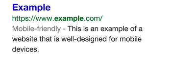
    To this end, Google has developed a mobile SEO guide to get you started. And take this test to see if your website has a mobile-friendly URL. What you are shooting for is the Google “mobile-friendly” label that appears in search results

    A search result with the mobile-friendly tag looks like this:

    Search Results with Mobile Friendly Tag

    Mobile SEO Best Practices

    Mobile Site Configuration

    Three ways to make a website mobile friendly:

    1. Responsive web design has Google’s stamp of approval. It’s the least risky course of action with the fewest opportunities for errors. Websites built using this design modality have a single URL for a piece of content. This allows users to share, like and link to the site. Getting a device optimized view requires no redirection. And that reduces page load time, saving resources for both your site and Google’s crawlers. This improvement in crawling efficiency helps Google index more of the site’s content and keep it appropriately fresh.
    2. Dynamic serving gets a grudging nod from Google. A server, relying on the user asking for a targeted page, reacts with distinctive HTML (and CSS) on the same URL. This server-side approach uses server-side plugins and custom user agent detection to decide how the website can be delivered to mobile devices. JavaScript detects the user’s device type when queried and adapts the code base so only the right layout is sent. It responds to desktops, smartphones and everything in between on the same URL but with different HTML and CSS.
    3. Separate mobile URLs – Every desktop URL has an equivalent URL serving mobile-optimized content with a separate set of HTML. And another equivalent URL serving tablet-optimized content with yet another set of HTML. These Separate mobile sites have the following configurations:
      • Separate URLs for desktop, mobile, tablet, etc. (m-dot, t-dot, etc.).
      • Different HTML is served for each site.

    Web Design

    1. Design your website for the best mobile user experience. Use HTML5 for special effects rather than flash. Lose the pop ups. They irritate mobile users and result in high bounce rates. Design the website for fat fingers — seriously. Make clicking easy.
    2. Don’t block CSS, JavaScript and Images – The most recent guide from Google focuses on ‘exposing of JavaScript, CSS and Images’.
    3. Page Speed Test – Mobile searchers want results fast, so Google tests for it. Slow load times lead to higher bounce rates. Images, codes, browser caching and redirects affect page speed optimization. More information can be found on Google Page Speed insights. Bottom line: Google prefers faster websites.
    4. Optimize Title and Descriptions: Keep titles and descriptions as tight as possible. With less screen space, go for quality.
    5. Optimize for local search – Think local since one in three searches is for something nearby. For local businesses include Name, Address and Phone Number (city as well) in the site’s meta data.

    Companies and designers that take the mobile friendly initiative to heart will come out on top, like the best ever search result. Those that don’t are bound to sink.