Tag: website

  • Tips to Improve Your Website Bounce Rate


    “What is your site’s Bounce Rate?” is probably a question that many webmasters have been asked. Simply defined, it’s the percentage of visitors who land on your site and then leave without visiting any other page. It is one of the most important site metrics, and webmasters and digital marketers try to keep that number as low as possible.

    Bounce rates are significant because they tell search engines that visitors are not finding what they were looking for on your site, or did not find the content compelling enough to check out any other pages. A high rate makes search engines more likely to conclude that your website doesn’t have content for specific topics or keywords, which then results in falling search rankings for your site.

    A website’s overall bounce rate is the average of bounce rates for all its pages. Free tools such as Google Analytics, Pingdom, as well as paid tools like Clicky can analyze and compute your website’s bounce rate. Once you have figured out your site’s bounce rate, it can be used as a benchmark to gauge improvements over time.

    A bounce rate over 50% is considered to be excessive, while 40–50% is considered average, and a rate under 40% means that your site is doing well.

    Tips to improve your website’s bounce rate

    1. Use a tag line for your business, which helps visitors get an idea about its products and/ or services, and sets expectations. Ideally, your tag line should be below your logo.
    2. The Title and Description of the page should clearly define the content on it. This makes more users click on your link in search results.
    3. Provide links from the home page to other sections of the site, e.g., products, services, blog, resources, and so on, and use page descriptions of two to three lines for each of them.
    4. Don’t clutter the page with too much information or very long paragraphs. It is also a good practice to use images that are descriptive and can help summarize content.
    5. It is highly advisable not to use auto-play for audio and video content on your site, which may force some visitors to leave the page immediately.
    6. Don’t make it mandatory for visitors to provide an email ID, phone number, or other information to enter your site. Most people are not comfortable with sharing contact information and will often exit sites that ask for it.
    7. Optimize the page load time. Ideally, it should take under 2 seconds to load a page. Surveys show that pages with high load times have high bounce rates.
    8. It is recommended not to display pop up ads, which are annoying to visitors.
    9. External or third-party links should open in new browser tabs. This helps keep visitors on your site for further engagement.
    10. Provide simple and easy site navigation. Complicated navigation schemes may force users to abandon the site.
    11. Your website must be mobile friendly. According to Google, the bulk of searches today take place through smartphones. This will help reduce the bounce rate for users on mobile devices.
    12. The search option within your site should be easy to find and use.
    13. Having unique and engaging content will greatly enhance time spent by visitors on your site, encouraging visitors to explore other sections and perhaps share your content with their friends on social media.

    These recommendations will not only improve a site’s bounce rate and user engagement, but also help improve its keyword rankings. Try these and improve your website bounce rate!

  • Crafting An Effective Call To Action


    Highly successful websites, landing pages, email campaigns and PPC ads all have an effective call to action in common. That’s a fact. It’s the CTA (call to action) button on your landing page that guides the users to goal conversion.  An effective CTA urges visitors to buy, subscribe, register, apply, download, vote, share, play and learn more.

    Here are a few best practices to help you improve on your CTA efforts.

    1. The CTA has to be aligned to the campaign objective

    Whether you are running a PPC campaign or an email marketing campaign, the CTA has to be perfectly aligned to your core objective.  Using the right text makes all the difference.

    One study showed that using first person increased conversion rates by 90%.  A simple “My free trial“ instead of “Your free trial” made all the difference.

    Use action oriented text, not the usual “Download here” or “Get Started Here”. If it’s an invitation to visit a video page, limit the CTA to Watch Now, not Learn More. If it’s a loan application, use Apply Now.

    2. It pays to tell them—clearly & loudly!

    Not every visitor to your landing page will a button presser be.  Those inclined to press the button need a clear cut call to action telling them to “just do it”.  The study quoted above found that simply adding “now” to the copy resulted in a nearly 30% improvement in conversion rates. “Now” – Buy Now. Subscribe Now.

    A good example of using “Now” in the CTA:

    CTA

    3. Make choices clear

    Emailer buttons are meant to be clicked.  So it is imperative that CTAs are clear and compulsive.  Do not clutter the copy with a maze of options. Simply show the way. If there are multiple objectives and communication assets, create more than one campaign or landing page, each with its own CTA.

    The perfect example of what not to do to a customer:

    CTA2


    4. Value delivery or click triggers

    Not many visitors will click on a PPC ad or banner stating the obvious or obviously exaggerating “facts”.  A CTA like Try It Free For 7 Days will always sound more credible than You Need To Try It To Believe It.  Show value by stating facts and focusing on user benefits. A confident visitor will take immediate action, so encourage that. Additional information — called a click trigger — provided near the clickable CTA button or text can be beneficial. Click triggers include:

    • Customer testimonials
    • Product benefits
    • Recognition
    • Short term incentives

    5. Placing it right and making it visible

    Websites, landing pages and e-mailers have different ways of presenting calls to action. Many effective communication assets present CTAs above the fold where almost 80% of visitors spend time. Color and design are of equal importance.  Maximize the use of white space around the button to highlight it. Use contrast and flow to good effect.

    Good button design is imperative. “In your face design” is not to anyone’s advantage, depending on the product and target audience. Placement and prominence are the keys to high call to action conversion rates. The bottom line is engagement.

    An example of flow, design and contrast:

    CTA3

    6. The look and feel matters

    Design a call to action button that’s both interesting and inviting. It should stand out and grab the visitor’s attention. Try some relevant embellishments (like an arrow pointing to the button) or animations (CTA and click trigger on the same button). More breathing space and button text in large fonts attract attention. Never forget to place alt tags for email buttons, or convert them into complete text, so the call to action never gets missed even if the images don’t load.

    CTA4

    Last but not least, run tests to understand what works or does not.  Do A/B testing and retain what works.

    Here’s wishing that your CTAs keep converting! If you want to know how we integrate calls to action to create high converting marketing assets at Position2, drop us a line.
    And if you have any new CTA ideas, please share them here for the benefit of our readers.

  • How to Optimize Content for Conversions [Infographic]

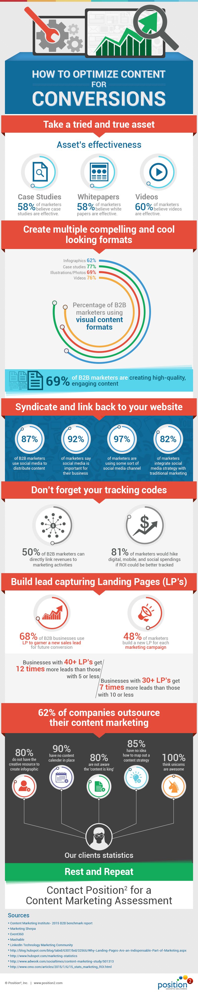
    Content marketing powers your online visibility and conversions. It is essential that you have your digital content across multiple channels in multiple formats. Asset creation, optimization, distribution, reporting, and tweaking are the important steps in your content marketing endeavor. Learn more in this incisive infographic now.

    How-Optimize-Content-For-Conversions-Position2-Infographic

  • New from Google: ‘Mobile-Friendly’ Labels in Mobile Search Results

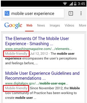
    To help mobile users improve their search experience, Google officially launched the mobile friendly label on its search snippet. It lets users know whether or not a website is mobile friendly. Not only will this feature enhance user experience on mobile devices, it suggests that Google may soon include mobile friendliness as one of the criteria for ranking sites.

    Is Google Experimenting with Mobile Friendly Ranking Factors

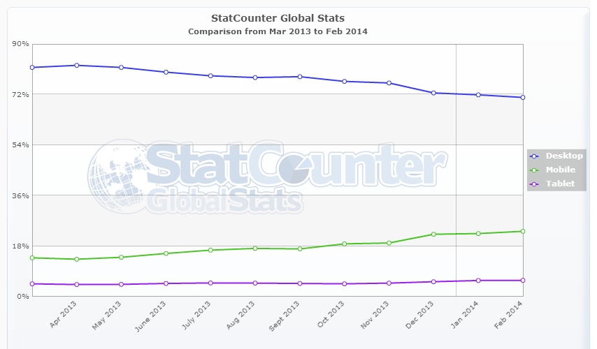
    We keep track of changes in Google’s approach on various metrics for mobile experience and it shows that Google is testing mobile friendly ranking factors to give a better search result for mobile users. In a recent survey conducted by Google, mobile search queries have found to grow faster whereas desktop search queries have begun to slowly decrease. So mobile adaptability is now highly relevant for optimal search results.

    platform-usage-mobile

    Image Source

    Why Mobile-friendly Labels?mobile-friendly-label

    The Google mobile friendly label tells users whether the website they click on is mobile friendly or not.  The mobile-friendly label is right there on the search snippet in the mobile SERP and it signals whether or not the website they are looking for is responsive to their mobile device. This saves time and eliminates the annoyance factor when a user discovers a web page isn’t mobile friendly.

    How does Google decide to add mobile-friendly labels on the search snippet on mobile SERP? There are guidelines to help websites conform in order to get the mobile friendly label. It is  highly likely that this new feature shows Google’s intent to make ease of usability on mobile devices, a major factor in deciding search engine rankings for websites.

     Contact us now to create mobile friendly websites to optimize your mobile prospects!