| This week’s hot news, events and videos from the online marketing and social media world. | ||||||||
 |
||||||||
 |
||||||||
|
||||||||
|
||||||||
| If you are reading this blog post via a RSS reader, please click here to subscribe. |
Tag: Web Design
-
Best of the Week | Web Design Trends for 2015, and much more…
-
Is Your Website Worth Clicking and much more…| Best of the Week
-
Your Website is Your Digital Persona. Is Yours Worth Clicking?
Today having a website is more than just a business imperative. You need to differentiate your website from that of your competitors. Your interface should be user friendly and at the same time it should be easy to maintain and upgrade. Having a robust site is very important since web security is of critical importance if you are really serious about scaling your business. You cannot take risks when it comes to web development. The world is going the digital way and you need to take cognizance of that.
The first impression that your website gives is critical. It can make or break a deal for your website. So put your best foot forward. Have a website that is visually appealing and informative at the same time. According to statistics most visitors to your site will have decided in the first few seconds whether your website is worth spending time on or they ought to give it a pass.
We can’t stress enough on how much content rules even in this day and age of gimmicks and smoke and mirrors. You cannot have mediocre content and expect first class results. Give your users first class content and sooner than later you will see how it benefits your website.
Functionality is a big issue with a lot of websites as webmasters do not think twice about the user experience. A website is a platform where people navigate depending on what they are seeking and if your website has broken links, insufficient information, lack of guidance then people will immediately move away from your site and that does not bode well for you.
As far as usability is concerned keep your website simple. Have a good layout with links clearly marked with where they are supposed to lead you. See to it that your pages load fast and efficiently. That way navigation is not an issue for your users and you can rest assured that rich dividends will surely follow.
You cannot have any quick fix solutions just because they are cheaper. When you are in for the long haul it will cost you dearly and we are not talking about the monetary cost here. How much are you willing to pay for a lost client? So you need to be discerning and have a studied approach.
The recent hacking of the BBC website is a case in point. This shows how serious you need to be when it comes to online security. A website endeavor is not a one-time approach but a continuous process of finding out what works and what does not. You will have some new technology coming up and you need to incorporate that in your site. Only then will you be able to compete in this cut throat world.

Today the Internet is going mobile. Due to faster wireless connectivity and cheaper smart phones and tablets, a revolution is underway in the mobile domain. But not all companies have a website that is optimized for the mobile platform. There is a whole generation of young men and women who have accessed the Internet for the first time on a mobile device. Now that is the generation which is of particular interest to the digital marketers. They drive the bulk of sales for products and services in the cyber space. Google has just come up with an exclusive set of tools to help you make your site mobile-friendly. Your site’s mobile compatibility might even become a deciding factor in ranking your website in the Google search engine results page.
Position² POV
Different websites have different requirements and you cannot have a cookie-cutter approach. It is better to build your website from scratch since that way all the things will be personalized to your particular needs. Wherever possible do not make use of plug-ins and such other technologies. Now this might seem costly but then it is worth it when it comes to scaling your business and offering a better experience for your users.
We have worked extensively with a gamut of industry verticals with respect to Web and Application Services. One of our recent works that is worth mentioning is a complete revamp of the website of a leading global information technology and outsourcing company headquartered in Bangalore. After we extensively worked on their website they got an exceptionally high rating in a record period of time from Acquia’s external scanning system. The site was evaluated with tests created by Drupal experts.
Another recent example is our work on the website of an emerging enterprise cloud storage solutions provider. Here we helped transform their marketing infrastructure with a transition to Drupal for the website, an upgrade to the WordPress blog. This and a lot of other improvements gave the company a renewed capability to reach new customers and partners.
You need to design, develop, maintain, migrate and optimize your website. Thus, having the backing of a firm which has extensive experience in all these is half the battle won. But still there is no room for complacency. The world of web technologies is changing at a very fast pace and you need to keep abreast of it at all times.
Contact us to learn how we can transform your business now!
-
Useful Considerations for Responsive Web Design
Mobile internet penetration is growing at an exponential rate. According to a recent eMarketer study, four out of five global Internet users in 2014 are mobile web users.
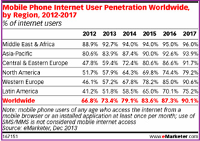
So, what does this growth rate mean to the online world?
- Mobile will become an essential platform for marketing in the digital world
- Website rendering across different mobile devices will assume significance
- Mobile friendly designs will be key to enhance user experience
- Optimizing for mobile will be an added advantage
Let us now look into two important actualities: having a mobile friendly site and optimizing the same.
As we talk of mobile friendly websites, a key aspect on the priority list is responsiveness. So, what is Responsive Web Design (RWD)? A responsive site is one which adapts to its surrounding environment and caters to users browsing with different device resolutions.
As Jeffrey Veen of Adobe says, “Responsive web design represents a fundamental shift in how we’ll build websites for the decade to come”.
Talking about responsive, one of the top sites we found during the recent football craze was the ‘Sequence World Cup’ campaign created by Sequence Agency, UK.

Having understood the importance of RWD, you need to look at three key considerations while making any website responsive:
1. Design considerations
The first thing that comes to mind while designing for responsiveness is whether to have a single site or multiple sites for desktop and mobile. Web designers need to decide if they need a single site and how information will flow across the web and mobile. Among these options, responsive sites occupy first place, followed by apps for mobile users which take user personas into consideration.
Other technical considerations which have been widely discussed include flexible images, grid foundation and media queries. A combination of these three makes a site responsive.
2. Performance considerations
The general perception has been that responsive sites take more time to load. Ever since Ethan Marcotte introduced the concept of responsive web, designers are trying out methods to improve performance and the following are some tips on the same:
- Serving images on Content Delivery Networks (CDNs) instead of servers and also making the images smaller
- Using Javacripts as the image loading technique (the ‘noscript’ technique)
- Using conditional loading and other CSS tricks that help improve performance. Online tools like Google Page Speed Tools help make performance better. This should be backed by tests at regular intervals.
3. Optimization considerations
While the above two considerations improve the user experience and performance of the website, it is important for a marketer to have the site optimized for search since there is always a correlation between RWD and website experience.
Responsive web and SEO go hand-in-hand. Google support for RWD-enabled websites and search engines catering to users’ requirements for all screen resolutions makes it important to optimize websites based on RWD. Usability is one key area that Google looks at while ranking websites. RWD helps users reach the right type of content across browsers.
Content strategy combined with keyword research and analysis merits close attention. The right balance of short and long tail, and geo-specific keywords with the right density should be considered.
Having the right blend of content for mobile sites is the winning point for mobile SEO. Mobile sites mean less content and the right way to optimize less content is to have only the most necessary part of the content on your mobile site.
Site structure and internal linking should not be neglected. A deep level of interlinks going up to 2-3 clicks helps leverage SEO value. Higher level pages should be cross-linked properly.
Google has in fact recommended use of RWD and said that websites optimized for mobile will be looked at with authority by search bots. With Google giving higher importance to Usability (UX), a responsive site with the basics of SEO covered should help cater to a mobile audience as well.
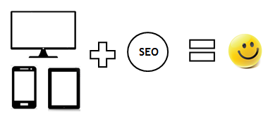
In the end, it’s all about providing a quality experience – be it on a desktop or on mobile.
Go responsive & stay updated!
Contributed by Chetan Rajasekaraiah, Senior SEO Specialist, SEO team