Tag: Smartphone

  • Mobilegeddon – The biggest thing since Y2K?

    Google rolled out a mobile-friendly update of its search service and search rankings this week and the 24-hour media beast immediately labeled it “mobilegeddon“. Is there need for panic in the streets? Not if you have paid attention to the impact of mobile over the last few years, and adjusted your website accordingly. ComScore research confirms that 56% of digital content is now consumed via smartphones, and that makes mobile optimization a necessity.

    Despite the warnings of digital apocalypse Google’s roll out only affects search rankings on smartphones (tablets not included), and only individual pages, not entire websites.  But it should encourage a cultural change. Importing websites to mobile just won’t wash going forward. Building a mobile strategy from the ground up is now the order of the day.
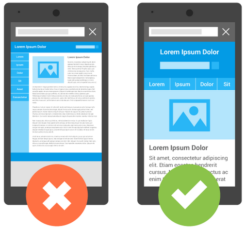
    mobilegeddonmobilegeddon

    Image Source

    But in the here and now, if you are a webmaster, test your website for mobile compatibility here. To diagnose your website and get a complete mobile usability issues report across your website pages, click here. If mobile users are a big part of your core target group do this sooner rather than later.

    Google Analytics will tell you what percentage of your traffic comes from mobile search.

    First you need to Sign Up. Then navigate to Audience>Mobile>Overview and review the desktop/mobile/tablet breakdown. What you see is the overview of how seriously you need to make the transition to a mobile-friendly website. Now.

    How to “Mobilegeddon-proof” your website

    To make certain your web content stays relevant in a “mobile-first” world, check these do’s and don’ts:

    • Text has to be readable without tapping and zooming
    • Avoid unplayable video content
    • Eliminate horizontal scrolling for better rendering
    • Do not place your links so close that tapping on one is impossible
    • Avoid app download interstitials that block users from completing tasks
    • Allow Googlebot access to your JavaScript, CSS and image files
    • If you have separate mobile URLs, have immaculate redirects for all mobile users
    • Do not have irrelevant cross-links when deploying separate mobile URLs
    • Use HTML5 standard tags for animations and videos for a seamless experience
    • Steer clear of mobile-only 404s
    • Recognize and accommodate the mobile users’ need for speed for. It’s paramount.

    Position² will keep you posted on more about how the Google ‘Mobilegeddon’ update pans out in the days and weeks ahead.
    Stay tuned!!!

  • UI and UX Trends in 2015

    Digital marketing has been trending for a couple of years, and now it’s in constant flux.  In 2014, we saw changes in mobile, HTML 5, scrolling, micro UX, flat UI and all time design principles.

    user-experience

    What’s likely in 2015?

    Responsive Design:

    According to comScore Report, smartphones and tablets account for 60% of all online transactions. Mobile devices and mobile apps currently drive 50% of traffic, and Cisco Systems forecasts that by 2018  the number will rise to more than 75% of traffic.

    In recent months, there has been an increase in the number of sites designed with mobile app-like  navigation, this as opposed to the traditional desktop navigation bars with several drop-down menus that are toggled when rendered on small screen devices.

    Today there is a need to design for the mobile form factor and your desktop version should be mobile friendly as well. Mobile ubiquity is the new mantra, not mobile-first. Designing for the mobile platform forces designers to streamline their web content according to user needs. Mobile was the platform that made digital marketers first listen to the users, and now the market has responded with “give me that for the desktop, too!”

    In 2015 and beyond, the mobile ubiquitous trend will continue to grow. Navigation will continue to simplify with fixed headers and minimalist design reducing clicks and clutter. Visitors are attracted to easy-to-use sites that allow them to quickly find what they’re looking. But don’t give up on visual appeal! Users still want to be dazzled by stunning visual elements.

    Long Scroll

    Scrolling is still predicted to dominate clicking in the future – simply because it works best in the mobile environment. It is easy and intuitive to use. It improves user experience. It limits the load time of the page with more interactive kinds of experience that users can have with the website.

    Flat Design

    No more patterns, shadows, gradients or bubbles. Now’s the time to embrace the simplicity of the flat design. It channels the key trend in recent web design – invincible minimalism. Perfect for all kinds of hand held devices, flat user interfaces provide a smooth and uncluttered page structure. Google engineered their future on mobile with a flat design or material design based on metaphors, bold graphics and meaningful motion. This could easily become a new trend in the already prominent flat design.

    Videos

    Users are looking to be entertained and large blocks of text are not the best way to do that. Video is easier, cost effective to produce and a great way to quickly deliver a message. There’s a science behind it. Our brain processes visuals more rapidly than other forms of information. By using video, even as a background element, you can highlight your core strengths and services to make an impact in a matter of seconds.

    Personalization of UX

    Showing users relevant content will improve their overall experience with your website. That’s why we all use cookies. But the ways in which we do it will change in 2015 to create a sense of continuity. Brands will use the recently read or visited functionality to render their websites more familiar and relevant. Knowing the user’s activity on your website, you can also try to propose some new content for his or her consideration, and cookies can help you do  it.

    These are some of the trends that can be expected in 2015 — that render to UI & UX.

    Get in touch with us to get your website optimized based on UI & UX now!