Tag: responsive websites

  • Drupal 8 Is A Boon For Digital Marketing | Position² Blog


    The way the average mobile user is tied to a device of choice, marketers can pretty much reach target customers anyplace, at any time. But when a visitor taps on a button that doesn’t respond, the frustrated users’ buyer’s journey ends on your digital doorstep. Drupal 8 is looking to solve that problem.

    A large group of developers, keeping true to the community’s open source roots, is working on Drupal’s Mobile Initiative. The goal is to make the Drupal 8 CMS mobile platform the best there is in today’s increasingly mobile world.

    The Drupal Mobile Initiative aims to address several key functionalities:

    • Responsive themes
    • Enhanced front-end usability
    • Use of administrative forms on mobile
    • Native app integration
    • Ability to use the marketing software you already know
    • Build campaigns with mobile in mind
    • Add, remove or revise content with ease
    • Easily deliver content segmented by audience, language and device type

    Solving these issues will give users a much more satisfying experience on their mobile devices. Websites will be quick to load, with easy to use responsive design. And marketers will be able to adjust their websites on the go.

    Mobile Accessibility

    If your website content isn’t easily accessible on mobile, you have a problem. The increasing use of mobile devices for access to instant information makes this imperative. The Drupal Mobile Initiative will help that access happen. Themes and modules have been developed for easy integration with JQuery Mobile, a framework that allows for cross-platform development of high-speed, easy-to-use mobile sites.
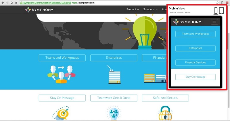
    Accessibility on Mobile for Symphony Services

    Drupal 8 means faster access to customers, as well as a decreased chance of drop offs due to site speed frustration– two things that need to be on any marketer’s radar.

    Making Mobile Editing A Reality

    Marketers can be mobile, just like their customers

    Drupal 8 is not only friendly for visitors, it’s editor-friendly, too. The Drupal Initiative aims to include full admin toolbar and capabilities when logged-in to a Drupal 8 site on a mobile device. Drupal 8’s responsive capabilities and mobile-friendly administrative features ensure your content looks great on any screen.

    A Powerful Tool in the Digital Marketer’s Toolkit

    The ability to provide on the go new and relevant content to your website will meet Google’s love of hyper-fresh results and lead to higher rankings. This makes Drupal 8’s Mobile Initiative a powerful marketing tool. Drupal 7’s powerful and flexible platform has already made it a great CMS for marketers. The mobile advantages being built into Drupal 8 give marketers the chance to take their game even higher.

    Integrate Your Best Of Breed Marketing Software

    Integrate your mix of CRM, Email, Marketing Automation and other software, using Drupal as the backbone.
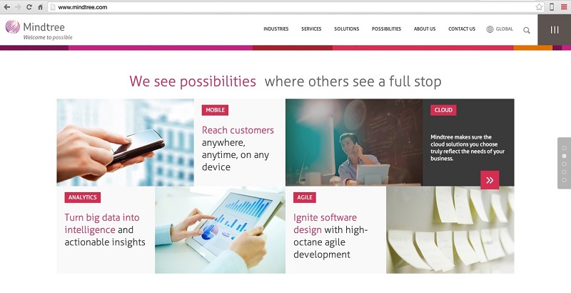
    Integrating best marketing software-Mindtree

    Reach Global Audiences

    Easily translate anything on your site with built-in user interfaces. The Drupal community produces automatic software translation updates.
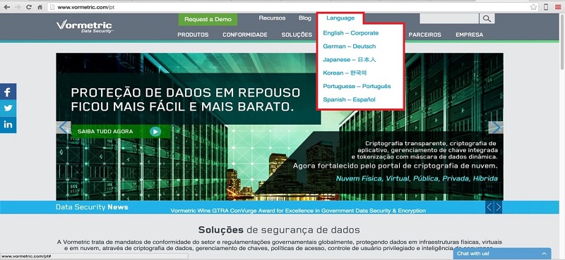
    Vormetric-Language Options on Website

    Ease Of Use

    With the new user interface in Drupal 8, your web staff can accomplish in minutes what used to take hours.

    Marketing With Drupal Doesn’t Need To Be An Uphill Climb

    Drupal is a great platform for marketers. With the right modules installed its flexibility and versatility simplify marketing tasks. For example, the metadata module tells Google what your content is about. Content with no metadata is far less likely to rank than the same content with well-optimized meta information.

    Is your enterprise website built with Drupal? Are you facing any maintenance or enhancement problems? We want to hear what you have to say – Voice your opinion about Drupal.

    Position2 at Drupal Camp Bangalore

  • Responsive Web Design (RWD) – What you should know?

    The use of mobile devices with differing display sizes to browse the web has all but erupted overnight, and most websites haven’t been optimized to handle the variety of screens. Enter Responsive Web Design (RWD), a technique capable of rendering the same content without disruption across devices with varying screen sizes.

    What is Responsive Web Design?

    Responsive web design is a web development approach that enables dynamic changes to the appearance of a web page, depending on the screen size and orientation of the device used. It’s a technique for building websites that works on mobile phones, tablets, TVs, game consoles and wearables as well as laptops and PCs. RWD is the best way for websites to eloquently adapt to different kinds of screens.

    How does Responsive Design work?

    With RWD web pages automatically adapt to the layout of the viewing environment using Fluid, proportions-based grids, Flexible or responsive images and Media queries.

    Fluid Grid:

    Website design initially followed in the tradition of the print media industry where a magazine or newspaper was the same fixed size, though in the case of websites the size was defined in terms of pixels. But the problem arises when website content is no longer viewed using only one fixed display size. A magazine is a magazine and the content is universally viewed in a specific fixed size. Websites can be viewed using a bigger format like a television or a smaller format like a smartphone, or a tablet or an even smaller smart watch. So, responsive web design builds websites with relative, not fixed units. The fluid grid concept calls for page element sizing to be in relative units like percentages, rather than absolute units like pixels or points.

    Flexible or Responsive Images:

    The idea of responsive images, in a nutshell: images shrink and adjust themselves within the confines of a fluid grid.

    Responsive_website_device_view

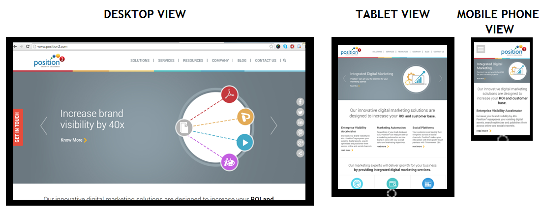
    Home page of www.position2.com viewed on various devices

    Desktop View gives maximum image size, but in the Tablet View the same image shrinks to display with full details while text content colonizes the remaining area of the screen. In Mobile Phone View, the image shrinks to display full details and text content occupies the remaining area of the screen. So, depending on the screen size, responsive images shrink or extend to display images in full details.

    RWD developers define the maximum and minimum dimensions to establish the limit of image pixilation in the CSS.

    img { max-width: 100%; }

    Media Queries:

    Websites are usually built for viewing on desktops and laptops in landscape mode. It’s challenging to take such a website and try to shrink it down to a mobile phone because mobile phones are used in portrait mode where the screen is longer than it is wide. With the website scrolling vertically, layouts several columns wide don’t work. This is where media queries come in. Media queries are a CSS technology, a core component of responsive design. Media queries allow CSS to be applied only when specific conditions are met (like when a webpage is viewed in portrait mode). When a design is too large or too small, a media query detects the site width and serves CSS that appropriately rearranges or adjusts the site’s content.

    Media queries code differs depending on the target device. Below is an example of media queries code for a smart phone in portrait mode:

    <style  type=”text/css”>

    @media (max-width: 320px) {
    #banner { width:275px; }
    #banner img { max-width:275px; max-height:83px; }
    #main { width:250px; }
    #main-content { width:250px;padding:0px;}
    #widget-container { width:250px; padding:0px; }
    .widget-content { width:250px; margin:5px;}
    .widget-text { display:none; }
    }
    </style>

    The challenge in responsive web design is to reorganize elements on larger pages to fit smaller, longer pages or vice versa. To make sure responsive design is successful, the design must be usable across an array of screen sizes (SEO experts will help the developer to define this limit based on the various devices used to access the website from Google Analytics).

    Advantages of Responsive Web Design

    A website with responsive web design gives a better user experience and the users are more likely to engage with the content.

    Cost efficient: When a website is developed using responsive web design, it basically means one website for all screen sizes and devices. You won’t have to build a separate mobile website.

    Smarter and better user experience: RWD gives users a better experience by offering the same content on a smaller device. It can be accessed from anywhere on any device at the sole discretion of the user.

    Future preparation: If you have a website built with responsive web design, then you are well prepared for the mobile future.

    Increase in conversion rate: A well-optimized website gives better user experience, encourages them to remain engaged with the site, and eventually leads them to customer conversion.

    One URL for one website: One website with a common URL can be used for different devices.

    Better user experience: Responsive websites are available to users anytime anywhere on any device.

    Bounce rate improvement: Do not underestimate the fickle nature of tablet and mobile users. They want their (same) desktop content and they want it now, otherwise they will bounce. And those bounce rates can get high. RWD enables delivery of the same content both in mobile and desktop view thus improving mobile traffic.

    Responsive web design delivers great user experience. It’s simply the best way to optimize a website for mobile devices. Visitors accustomed to viewing websites on larger screens expect the same experience on their smaller devices. If a website is not well optimized, then it annoys the user and bounce rates escalate. The solution is a responsive website with well optimized content ensuring that users see what they really want to see at first glance.

    Contact us now to deploy responsive web design & never miss another opportunity!

  • Despite Strong Growth, Share of Online Display Advertising Spend Well Behind TV

    Online Display Advertising Spend Well Behind TV

    A recent Nielsen study revealed that the growth of display advertising on the internet surged to an all-time high touching 32% in 2013. This growth covers global display advertising across the web, mobile internet and apps.

    Internet display advertising is big. But, it is not the biggest fish in the advertising pond. Yet.

    Despite its impressive growth, (which is also the fastest compared to other media platforms), the share of global online display advertising only accounts for 4.5% of overall ad spends. The growth rate of TV advertising is much lower at 4.3% but it continues to be a popular choice with most marketers as is evident by its 57.6% share of ad spends.

    Web display advertising grew rapidly in 2013. But, as the Nielsen study shows, it’s just an example of high growth on a small base. The allure of video content, which is behind the continuing success of TV as an advertising medium, is drawing more companies to opt for videos to be a part of their online marketing mix.

    Small but Versatile

    The sheer indispensability of the Internet often makes us forget just how young the medium is. Given its age, its penetration and versatility is amazing and it has a number of advantages over its older and more traditional competitors. One can access online content across a variety of screens from PC, laptop, tablet to mobile. One can even watch TV over the Internet! Web advertising has an indisputable trump card in multi-screen advertising.

    With media multi-tasking becoming a common phenomenon today, the call of multi-screen advertising is growing louder. Brands can target users on different devices by using tools like responsive websites.

    Of the many drivers that are powering online display advertising growth, multi-screen advertising is significant as it allows advertisers to stay in touch with audiences even as they migrate across screens as is their habit these days.

    Multi-Screen Advertising Set to Grow Further

    Tools like Twitter TV ad targeting that help brands in targeting TV viewers using Promoted Tweets and events like the Google-comScore deal that will help measure different ad formats across the web in real-time makes Internet advertising more appealing to marketers. Each of these events is likely to strengthen the case for internet advertising and drive greater spends.

    Multi-screen advertising specifically can become a huge area of investment in the near future because it leverages the Internet’s versatility.

    Conclusion

    Despite its obvious promise, internet advertising is still in a very nascent stage. It does have formidable competition in TV but that hasn’t stopped it from growing significantly. Digital marketers who are running online display ads are gaining valuable learning (and business) from tapping into this near ubiquitous, extremely versatile medium.

    Over the last few years, we’ve witnessed the galloping influence of the Internet and it doesn’t show any signs of letting up. If anything, it’s increasing! We’re betting on it as the medium to market through and advertise on.

    What are you betting on? TV or the Internet?

    Image Source: 401(K) 2012