Tag: Responsive web design

  • 6 Website Design Pitfalls To Avoid

    “Design is the method of putting form and content together. Design, just as art, has multiple definitions; there is no single definition. Design can be art. Design can be aesthetics. Design is so simple, that’s why it is so complicated.”

    Paul Rand

    Last year’s ‘hip and cool’ website features look dowdy today. You have to stay ahead of the curve, and the curve isn’t sitting still. A well designed website – in terms of features, functionality, user experience, navigation and content — is an absolute must have.

    • 48% of people queried cited website design as the number one factor in deciding business credibility
    • 95% of those queried agree with the statement: “good user experience just makes sense” (Econsultancy)
    • 6% of mobile users report having difficulty interacting with a web page, and 44% complain that navigation was difficult (Source: Keynote)
    • When a page takes 4 seconds or more to load, the change in a website bounce rate spikes 100%. At 8 seconds or more to load it jumps to 150%. (Source: Mobile Joomla)

    These 6 design trends are way obsolete:

    1. Ancient Relics

    The Big No-No’s: Page hit counters, animated gifs, flashing banners, scrolling marquees, flash intros, auto-play videos, background music, images opening in new windows, multiple font faces, styles and colors.

    2. Lack of Whitespace

    When the trend is minimalistic design with crisp content, you have to use whitespace correctly. If you don’t, your content will appear to be cluttered and unorganized. Whitespace strikes a balance between positive (or non-white) and negative space, which is key to aesthetic composition. Beware of inexpert use of white space. It can make a page look incomplete.
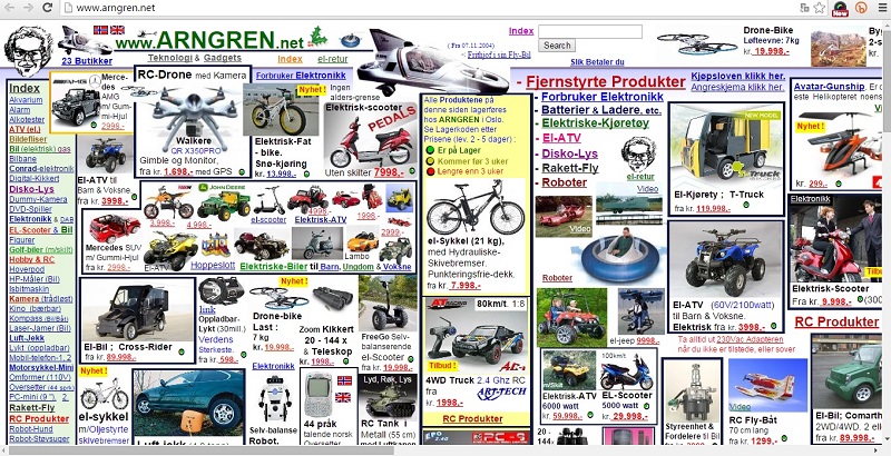
    crowded webdesign

    3. Overflowing Text Content

    Think snackable content. Bite size is best. Break up any long text content into relevant photos and graphics, titles, bullets and paragraphs consisting of no more than 3 or 4 well-written sentences.
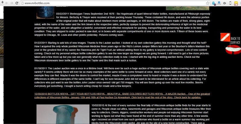
    overflowing text content

    4. VIBGYOR Color Scheme

    If your website is using more than 2 primary colors it is time for a redesign. A simple color scheme that’s pleasing to the eye is the new norm.  Color increases web recognition by 80%. Sites with dark color schemes increase growth by 2%; sites with lighter color schemes experience 1.3% growth.
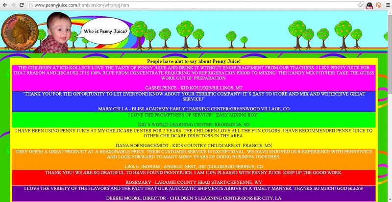
    bad color scheme in webdesign

    5. Non – Responsive Websites

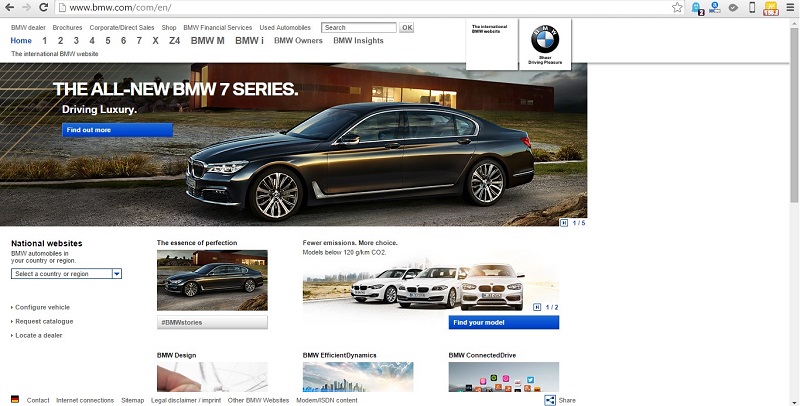
    User devices range from hand-held smartphones and tablets to large widescreen PC or laptop displays. A responsive website is an essential part of a seamless user experience across all devices. Fixing your website page width at 600px, 800px, 960px , etc. will kill any user interest.
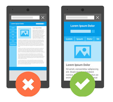
    non responsive web design

    non responsive web design - bmw

    6. Bad Stock Photos

    While using visuals in your marketing materials attracts and engages your viewers, unrealistic, cheesy and obviously fake stock photos will cause more harm than good. Avoid using stock images that are a clear disconnect from the values of the website and do nothing more than occupy space.

    bad stock photos

    If your website isn’t designed for the future, it’s not designed for today. It may be past time to reconsider the look of your digital calling card.

    Use the comment box below to share your thoughts on modern, hip and uber-cool website design trends and best practices.

  • Web Design Trends for 2015

    With a quick look back at Web Design 2014 you’ll see mobile, HTML 5, scrolling, micro UX, flat UI and the  king of design principles, minimalism, were all the rage.

    For what’s headed your way in Web Design 2015, read on…

    Top 10 design trends in 2015

    1. One Page Layout

      Embrace the mobile and choose one page layout to deliver a web project on iPhone, tablet or any other mobile device in the most optimal way. With one page layout you view the entire site without clicking on links to visit additional pages. You scroll instead, because everything is on a single page. This is the navigation technique requiring less page loading, less flowing data, less dynamic interaction with the end result, a smoother user experience.

    2. Responsive Design

      Responsive design has become the new standard for web design over the past few years. 2015 is no exception. Responsive web design and mobile friendly websites were made for each other.

    3. Focus on Typography

      iA’s Oliver Reichenstein rightly said “Web design is 95% typography”. Web typography isn’t limited to the use of fonts on your website. Rather, it’s the art of creating and manipulating the typefaces and white spaces to enhance communication and readability.

    4. Ghost Buttons and Big Background

      Make your site stand out by prominently displaying great content. Ghost buttons are pretty simple, are becoming more widely used, are minimal, stylish, very easy to create, and usually combined with a cool and simple hover animation. What caught on in 2014 will expand in 2015.

    5. SVG

      Scalable Vector Graphics may be the best format for responsive web design. It’s an ideal fit for flat and material design. The SVG advantage is its vector format which maintains sharpness after scaling. It can be implemented with CSS or JavaScript and can be used to create animations. With SVG, web designers focus on their design and spend less time thinking about different screen resolutions.

    6. Card Design

      Websites relying on an arrangement that resembles cards or tiles are usually very simple while presenting the viewer with as much information as possible. Card design works well with advertising products or displaying a portfolio. Social media giants such as Spotify, Pinterest, Twitter and Google have caught on and are using the tile-like arrangement.

    7. Flat Design/ Material Design for Mobile

      Incorporating Skeuomorphism into Flat Design is Material Design’s raison d’etre. The everyday objects and interactions we know in the real world are thrown into the sleek minimalism and mobile-friendliness of Flat. This results in an intuitive and device-friendly design style, convenient for both the machine and the user. The best of both worlds.

    8. Parallax Scrolling

      As the mobile web continues to grow and web design continues to skew in the direction of a more effective and enjoyable mobile experience, scrolling will continue to dominate clicking. It’s more intuitive, easier to do, cuts down on load times and allows for more dynamic interaction to take place between the user and the website. Parallax scrolling first became popular in early 2014, but look for it on more and more websites in 2015. With parallax scrolling you can create flexible and unique web pages that will surprise your visitors with effectiveness and convenience. It works especially well in creating single page websites or storytelling.

    9. Microinteractions

      Microinteractions are contained experiences or moments within a module on a website that revolve around a single use case, for example the email signup box that pops up on the website and wiggles back and forth on the screen, giving a playful personality to an otherwise static graphic. Microinteractions promote an increase in user engagement — in the case above, more email signups. You’ll see this theory begin to permeate web design in 2015. As developers begin to think along these lines you’ll see more WordPress themes and plugins.

    10. Personalized UX

      Look for cookies rehabilitation in 2015, just as certain popups have made a classier return with better design and best practices in place. The technique of using cookies to display certain content to repeat visitors can be used far more creatively than simply displaying spam and relentlessly up-selling.

    Contact Position² for professionally designed web pages to stay ahead of the trends!