Tag: Mobilegeddon

  • Google Panda 4.2 – Algorithm Refresh


    Tens months have passed since Google’s last Panda update. Now it’s time for a refresh, again. Here comes Google Panda 4.2 — though, as Google points out, it will take several months for the complete roll-out.

    Here’s a quick Google Panda recap: The first update was announced by Google in Feb 2011. There have been four in 2015, including Mobilegeddon in April. Google’s apparent purpose is to promote quality content and reduce web spam. Panda 4.2 is the 28th iteration of Panda updates, and was announced by Google’s John Mueller and Gary Illyes on July 18. According to Search Engine Land, 2-3% of search queries are affected by this refresh, and it may take months to see the results of any changes. Gary Illyes also confirms on Twitter that the rollout will be on a global scale:

    Gary Illyes tweets -Google Panda 4.2 Update

    What does this mean to websites?

    1. Sites that were hit by Panda 4.1 and have since taken remedial measures now have a chance to regain rankings. Since the rollover effect is still to be witnessed in detail, many webmasters are not really feeling the heat.

    Changes Recorded after Google Panda Update

    Image Source 

    1. Quality content will continue, in part, to determine SEO and search ranking. Websites with good quality and original content achieve greater significance in the eyes of the search giant.

    Position2 PoV

    Our thoughts and recommendations haven’t changed from what we said about Google Panda 4.1.  This new iteration is a refresh. We continue to recommend that our clients develop unique and original content on their sites and avoid thin content. Overall content placement should be aimed at users and should provide quality information in a way that is easy for a user to understand.

    Let us know your thoughts about this update in the comments section below.

  • Evolution of Mobile SEO: Is Your Website Mobile Friendly?

    Evolution of Mobile SEO

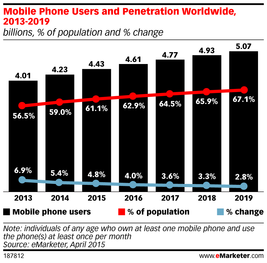
    With 4.43 billion individuals using mobile phones world wide — 1.84 billion of them smart phones –  and with half of all local searches carried out on mobile devices, it’s no wonder Google has become determined to deliver the best possible mobile user experience on search. With continuous algorithm updates the company’s message is clear: improve your mobile web development practices or suffer the consequences.

    Mobile Phone Users and Penetration Worldwide - 2013 -2019

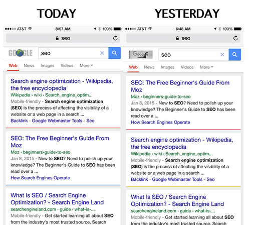
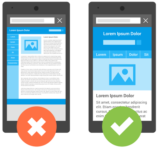
    The April 21st Mobile-friendly Ranking Algorithm rollout – Mobbilegeddon —  has had a significant impact on mobile search results, with websites not quite mobile friendly dropping in rankings overnight.

    Moz discovered as much when their rank on mobile search for search query “SEO” dropped a notch in favor of a mobile-friendly source.  Read our previous blog on Mobilegeddon to learn how it has affected search rankings on smartphones.

    Mobilegeddon's affect on Mobile Search

    Your task going forward:

    • learn to configure your website for mobile
    • help search engines understand the website configuration
    • avoid common mistakes along the way

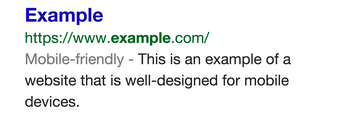
    To this end, Google has developed a mobile SEO guide to get you started. And take this test to see if your website has a mobile-friendly URL. What you are shooting for is the Google “mobile-friendly” label that appears in search results

    A search result with the mobile-friendly tag looks like this:

    Search Results with Mobile Friendly Tag

    Mobile SEO Best Practices

    Mobile Site Configuration

    Three ways to make a website mobile friendly:

    1. Responsive web design has Google’s stamp of approval. It’s the least risky course of action with the fewest opportunities for errors. Websites built using this design modality have a single URL for a piece of content. This allows users to share, like and link to the site. Getting a device optimized view requires no redirection. And that reduces page load time, saving resources for both your site and Google’s crawlers. This improvement in crawling efficiency helps Google index more of the site’s content and keep it appropriately fresh.
    2. Dynamic serving gets a grudging nod from Google. A server, relying on the user asking for a targeted page, reacts with distinctive HTML (and CSS) on the same URL. This server-side approach uses server-side plugins and custom user agent detection to decide how the website can be delivered to mobile devices. JavaScript detects the user’s device type when queried and adapts the code base so only the right layout is sent. It responds to desktops, smartphones and everything in between on the same URL but with different HTML and CSS.
    3. Separate mobile URLs – Every desktop URL has an equivalent URL serving mobile-optimized content with a separate set of HTML. And another equivalent URL serving tablet-optimized content with yet another set of HTML. These Separate mobile sites have the following configurations:
      • Separate URLs for desktop, mobile, tablet, etc. (m-dot, t-dot, etc.).
      • Different HTML is served for each site.

    Web Design

    1. Design your website for the best mobile user experience. Use HTML5 for special effects rather than flash. Lose the pop ups. They irritate mobile users and result in high bounce rates. Design the website for fat fingers — seriously. Make clicking easy.
    2. Don’t block CSS, JavaScript and Images – The most recent guide from Google focuses on ‘exposing of JavaScript, CSS and Images’.
    3. Page Speed Test – Mobile searchers want results fast, so Google tests for it. Slow load times lead to higher bounce rates. Images, codes, browser caching and redirects affect page speed optimization. More information can be found on Google Page Speed insights. Bottom line: Google prefers faster websites.
    4. Optimize Title and Descriptions: Keep titles and descriptions as tight as possible. With less screen space, go for quality.
    5. Optimize for local search – Think local since one in three searches is for something nearby. For local businesses include Name, Address and Phone Number (city as well) in the site’s meta data.

    Companies and designers that take the mobile friendly initiative to heart will come out on top, like the best ever search result. Those that don’t are bound to sink.


  • SMX Advanced 2015

    We attended SMX Advanced. We learned a lot. We met lots of interesting people.  And we had a whole lot of fun.

    Here are some of the “latest and greatest” highlights from this year’s edition of SMX Advanced

    • Google Webmaster Trends Analyst Gary Illyes announced at SMX Advanced that the next Panda update will roll out in the upcoming weeks. Illyes characterized this change as a data refresh, not an algorithm update.
    • Tips and Tricks to Survive Mobilegeddon was fascinating. This session broke down Google’s mobile friendly algorithm upgrade and shed light on what you need to pay attention to in order to drive maximum mobile traffic from Google.
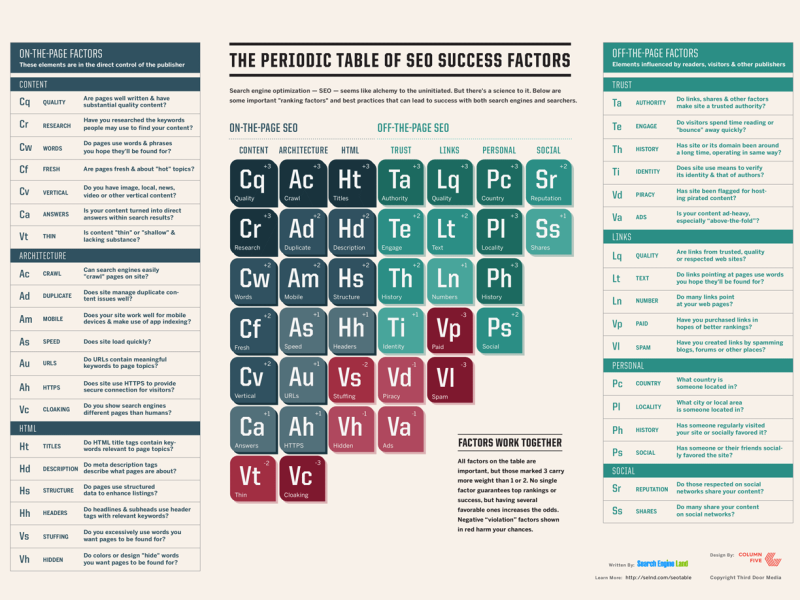
    • The Periodic Table of SEO Ranking Factors summarizes the major factors to focus on for search engine ranking success. It’s a cool, innovative way of explaining SEO factors and educating marketers re which type of content creates the right “signals” to be better ranked by search engines.

    seo-success factors-periodic table

    Image Source

    SMX After Dark 2015 was the place to unwind after a long day at the conference. And unwind is exactly what we did!

    p2 at SMX advanced

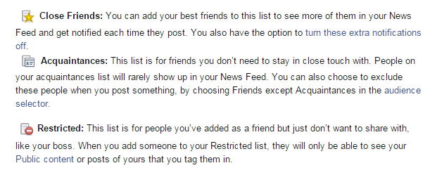
  • Mobilegeddon? You Almost Missed the Facebook Update!

    While Google busied itself distracting the world on April 21 with “Mobilegeddon“, its mobile-friendly update, Facebook quietly released an update all its own. Did you notice?

    Facebook insists that the News Feed exists for one purpose only – to give you the content that matters to you. This latest News Feed update is specifically designed to improve the Facebook users’ experience, aiming at a better balance of content from friends versus content from businesses, publishers, public figures, and local organizations.

    The update comes in three layers.

    #1: More Content for Content-starved Users

    The rule that hitherto prevented you from seeing multiple posts from the same source has now been scrapped. When you run out of recent content and scroll through the News Feed, you’ll now see multiple posts from the same sources.

    #2: Updates from Friends Given a Thumbs Up

    Going forward, content from friends will be placed higher in the News Feed. The Menlo Park social media giant had been getting a lot of negative feedback from users who were missing out on important updates from close friends — photos, videos, status changes, links.

    facebook friends

    #3: Friends’ Likes & Comments on Posts is a No-show

    Likes and comments made by your friends on a Post have been relegated to the bottom of the News Feed so you can focus on what your friends are really saying.

     Latest Facebook mobile-friendly updates

    Advertisers Be Warned!

    Advertisers will have to make adjustments. Higher grade content posted with consistency will get noticed. Anything else is likely to sink from sight.

  • Mobilegeddon – The biggest thing since Y2K?

    Google rolled out a mobile-friendly update of its search service and search rankings this week and the 24-hour media beast immediately labeled it “mobilegeddon“. Is there need for panic in the streets? Not if you have paid attention to the impact of mobile over the last few years, and adjusted your website accordingly. ComScore research confirms that 56% of digital content is now consumed via smartphones, and that makes mobile optimization a necessity.

    Despite the warnings of digital apocalypse Google’s roll out only affects search rankings on smartphones (tablets not included), and only individual pages, not entire websites.  But it should encourage a cultural change. Importing websites to mobile just won’t wash going forward. Building a mobile strategy from the ground up is now the order of the day.

    mobilegeddonmobilegeddon

    Image Source

    But in the here and now, if you are a webmaster, test your website for mobile compatibility here. To diagnose your website and get a complete mobile usability issues report across your website pages, click here. If mobile users are a big part of your core target group do this sooner rather than later.

    Google Analytics will tell you what percentage of your traffic comes from mobile search.

    First you need to Sign Up. Then navigate to Audience>Mobile>Overview and review the desktop/mobile/tablet breakdown. What you see is the overview of how seriously you need to make the transition to a mobile-friendly website. Now.

    How to “Mobilegeddon-proof” your website

    To make certain your web content stays relevant in a “mobile-first” world, check these do’s and don’ts:

    • Text has to be readable without tapping and zooming
    • Avoid unplayable video content
    • Eliminate horizontal scrolling for better rendering
    • Do not place your links so close that tapping on one is impossible
    • Avoid app download interstitials that block users from completing tasks
    • Allow Googlebot access to your JavaScript, CSS and image files
    • If you have separate mobile URLs, have immaculate redirects for all mobile users
    • Do not have irrelevant cross-links when deploying separate mobile URLs
    • Use HTML5 standard tags for animations and videos for a seamless experience
    • Steer clear of mobile-only 404s
    • Recognize and accommodate the mobile users’ need for speed for. It’s paramount.

    Position² will keep you posted on more about how the Google ‘Mobilegeddon’ update pans out in the days and weeks ahead.
    Stay tuned!!!