Tag: Mobile

  • UI and UX Trends in 2015

    Digital marketing has been trending for a couple of years, and now it’s in constant flux.  In 2014, we saw changes in mobile, HTML 5, scrolling, micro UX, flat UI and all time design principles.

    user-experience

    What’s likely in 2015?

    Responsive Design:

    According to comScore Report, smartphones and tablets account for 60% of all online transactions. Mobile devices and mobile apps currently drive 50% of traffic, and Cisco Systems forecasts that by 2018  the number will rise to more than 75% of traffic.

    In recent months, there has been an increase in the number of sites designed with mobile app-like  navigation, this as opposed to the traditional desktop navigation bars with several drop-down menus that are toggled when rendered on small screen devices.

    Today there is a need to design for the mobile form factor and your desktop version should be mobile friendly as well. Mobile ubiquity is the new mantra, not mobile-first. Designing for the mobile platform forces designers to streamline their web content according to user needs. Mobile was the platform that made digital marketers first listen to the users, and now the market has responded with “give me that for the desktop, too!”

    In 2015 and beyond, the mobile ubiquitous trend will continue to grow. Navigation will continue to simplify with fixed headers and minimalist design reducing clicks and clutter. Visitors are attracted to easy-to-use sites that allow them to quickly find what they’re looking. But don’t give up on visual appeal! Users still want to be dazzled by stunning visual elements.

    Long Scroll

    Scrolling is still predicted to dominate clicking in the future – simply because it works best in the mobile environment. It is easy and intuitive to use. It improves user experience. It limits the load time of the page with more interactive kinds of experience that users can have with the website.

    Flat Design

    No more patterns, shadows, gradients or bubbles. Now’s the time to embrace the simplicity of the flat design. It channels the key trend in recent web design – invincible minimalism. Perfect for all kinds of hand held devices, flat user interfaces provide a smooth and uncluttered page structure. Google engineered their future on mobile with a flat design or material design based on metaphors, bold graphics and meaningful motion. This could easily become a new trend in the already prominent flat design.

    Videos

    Users are looking to be entertained and large blocks of text are not the best way to do that. Video is easier, cost effective to produce and a great way to quickly deliver a message. There’s a science behind it. Our brain processes visuals more rapidly than other forms of information. By using video, even as a background element, you can highlight your core strengths and services to make an impact in a matter of seconds.

    Personalization of UX

    Showing users relevant content will improve their overall experience with your website. That’s why we all use cookies. But the ways in which we do it will change in 2015 to create a sense of continuity. Brands will use the recently read or visited functionality to render their websites more familiar and relevant. Knowing the user’s activity on your website, you can also try to propose some new content for his or her consideration, and cookies can help you do  it.

    These are some of the trends that can be expected in 2015 — that render to UI & UX.

    Get in touch with us to get your website optimized based on UI & UX now!

  • Responsive Web Design (RWD) – What you should know?

    The use of mobile devices with differing display sizes to browse the web has all but erupted overnight, and most websites haven’t been optimized to handle the variety of screens. Enter Responsive Web Design (RWD), a technique capable of rendering the same content without disruption across devices with varying screen sizes.

    What is Responsive Web Design?

    Responsive web design is a web development approach that enables dynamic changes to the appearance of a web page, depending on the screen size and orientation of the device used. It’s a technique for building websites that works on mobile phones, tablets, TVs, game consoles and wearables as well as laptops and PCs. RWD is the best way for websites to eloquently adapt to different kinds of screens.

    How does Responsive Design work?

    With RWD web pages automatically adapt to the layout of the viewing environment using Fluid, proportions-based grids, Flexible or responsive images and Media queries.

    Fluid Grid:

    Website design initially followed in the tradition of the print media industry where a magazine or newspaper was the same fixed size, though in the case of websites the size was defined in terms of pixels. But the problem arises when website content is no longer viewed using only one fixed display size. A magazine is a magazine and the content is universally viewed in a specific fixed size. Websites can be viewed using a bigger format like a television or a smaller format like a smartphone, or a tablet or an even smaller smart watch. So, responsive web design builds websites with relative, not fixed units. The fluid grid concept calls for page element sizing to be in relative units like percentages, rather than absolute units like pixels or points.

    Flexible or Responsive Images:

    The idea of responsive images, in a nutshell: images shrink and adjust themselves within the confines of a fluid grid.

    Responsive_website_device_view

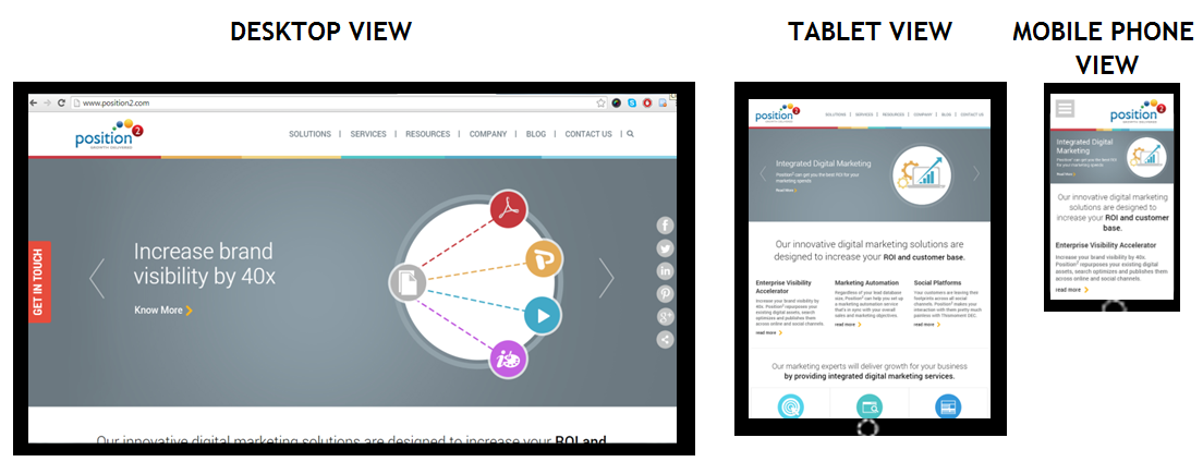
    Home page of www.position2.com viewed on various devices

    Desktop View gives maximum image size, but in the Tablet View the same image shrinks to display with full details while text content colonizes the remaining area of the screen. In Mobile Phone View, the image shrinks to display full details and text content occupies the remaining area of the screen. So, depending on the screen size, responsive images shrink or extend to display images in full details.

    RWD developers define the maximum and minimum dimensions to establish the limit of image pixilation in the CSS.

    img { max-width: 100%; }

    Media Queries:

    Websites are usually built for viewing on desktops and laptops in landscape mode. It’s challenging to take such a website and try to shrink it down to a mobile phone because mobile phones are used in portrait mode where the screen is longer than it is wide. With the website scrolling vertically, layouts several columns wide don’t work. This is where media queries come in. Media queries are a CSS technology, a core component of responsive design. Media queries allow CSS to be applied only when specific conditions are met (like when a webpage is viewed in portrait mode). When a design is too large or too small, a media query detects the site width and serves CSS that appropriately rearranges or adjusts the site’s content.

    Media queries code differs depending on the target device. Below is an example of media queries code for a smart phone in portrait mode:

    <style  type=”text/css”>

    @media (max-width: 320px) {
    #banner { width:275px; }
    #banner img { max-width:275px; max-height:83px; }
    #main { width:250px; }
    #main-content { width:250px;padding:0px;}
    #widget-container { width:250px; padding:0px; }
    .widget-content { width:250px; margin:5px;}
    .widget-text { display:none; }
    }
    </style>

    The challenge in responsive web design is to reorganize elements on larger pages to fit smaller, longer pages or vice versa. To make sure responsive design is successful, the design must be usable across an array of screen sizes (SEO experts will help the developer to define this limit based on the various devices used to access the website from Google Analytics).

    Advantages of Responsive Web Design

    A website with responsive web design gives a better user experience and the users are more likely to engage with the content.

    Cost efficient: When a website is developed using responsive web design, it basically means one website for all screen sizes and devices. You won’t have to build a separate mobile website.

    Smarter and better user experience: RWD gives users a better experience by offering the same content on a smaller device. It can be accessed from anywhere on any device at the sole discretion of the user.

    Future preparation: If you have a website built with responsive web design, then you are well prepared for the mobile future.

    Increase in conversion rate: A well-optimized website gives better user experience, encourages them to remain engaged with the site, and eventually leads them to customer conversion.

    One URL for one website: One website with a common URL can be used for different devices.

    Better user experience: Responsive websites are available to users anytime anywhere on any device.

    Bounce rate improvement: Do not underestimate the fickle nature of tablet and mobile users. They want their (same) desktop content and they want it now, otherwise they will bounce. And those bounce rates can get high. RWD enables delivery of the same content both in mobile and desktop view thus improving mobile traffic.

    Responsive web design delivers great user experience. It’s simply the best way to optimize a website for mobile devices. Visitors accustomed to viewing websites on larger screens expect the same experience on their smaller devices. If a website is not well optimized, then it annoys the user and bounce rates escalate. The solution is a responsive website with well optimized content ensuring that users see what they really want to see at first glance.

    Contact us now to deploy responsive web design & never miss another opportunity!

  • Mobile Advertising Set to Dominate

    The stage is set for the explosion of mobile advertising in the year 2015. Finally digital marketers are able to connect all the dots, tie all the loose ends, dot the i’s and cross the t’s. As a digital marketer your digital advertising strategy should be more mobile-centric, in order to reap rich dividends.

    Today’s users don’t need bulky desktops or laptops to enjoy a seamless web experience. As far as mobile form factor is concerned, smartphone and tablet screen size is large, the data speeds are awesome, and prices are affordable. More people today are browsing the Internet on the go. All this makes targeting prospects using mobile devices, lucrative and irresistible.

    The Mobile Paradox

    igital_mobile-ad-spending

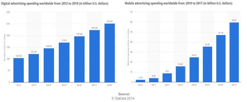
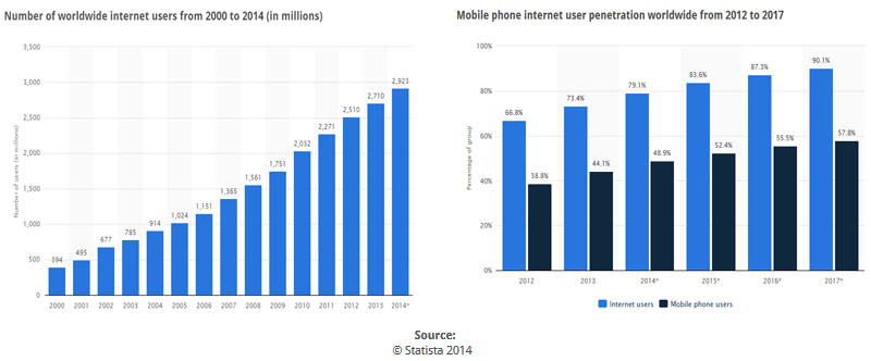
    Comparing the above two spending, it is apparent that mobile advertising is still in its infancy. But that doesn’t mean that the mobile Internet users are a minority, anymore. For the first time since Internet was conceptualized, mobile internet users have actually overtaken non-mobile internet users. This gap will only widen in the days and years to come.

    internet_mobile-internet-penetration

    The above charts show a comparison of number of mobile ‘Internet users‘ vs. the total number of ‘Mobile phone users‘. The mobile Internet users’ statistics can no longer be ignored. Digital marketers not having a mobile marketing strategy will feel the heat, come 2015.

     A Peek into the Mobile Internet Paradigm

    Having a mobile-friendly version of all your online assets, be it demos, applications, sales materials, communications, et al is no longer optional. It is critical. People use the Internet for not just checking emails and catching up with friends on social networking sites but also to research about products and services. As a B2B digital marketer, it is high time you realize that your target audience is making influential business decisions while on the move.

    You cannot have a mobile marketing strategy just as an add-on to your overall digital marketing strategy. You need to deliver top-notch mobile experience at all times. Have a mobile-first strategy for marketing, sales, advertising, SEO, CRM and such other things in order to stay ahead of the curve in 2015 and beyond.

    How will the mobile form factor shape your advertising strategy in 2015 and beyond? Do let us know.

    Contact us now for a targeted mobile advertising campaign.

  • Google Introduces New Sitelinks Search Box

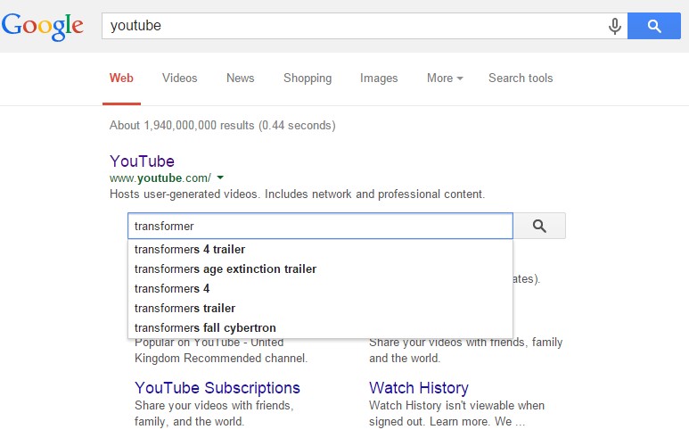
    Google introduced a new Sitelink search box feature that gives webmasters the ability to control searching within their site. Websites seen in the SERP (Search Engine Results Page) now display a site search box above the Sitelinks. The new search box has been designed to simplify a user’s query for specific content on your website, working directly through your own website search pages.

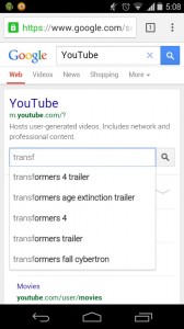
    The Sitelinks Search Box is displayed in a prominent position and the new functionality eliminates a step in a user’s content search process. The auto-complete feature is also used to great advantage when a user types search terms into the search box. The new search box is available for both desktop and mobile searches.

    Desktop version:

    Position2 - An example of the desktop version sitelinks


    Mobile version:

    Position2 - An example of the mobile version sitelinks

    The new Sitelink Search Box sends the user directly to your website’s search pages. You need to markup your pages correctly to enable this feature. Websites must have a working search engine function to implement this feature, and webmasters should use Schema.org markup on the home page.

    Best practices for schema markup (from the Sitelink Search Box implementation guidelines) include:

    • Put the markup on the homepage of your site. (It is not necessary for the markup to be repeated on other pages.)
    • Use JSON-LD. (Alternatively, you can use microdata.)
    • Specify only one URL search pattern for the target. (Google is experimenting with multiple pattern support, so if you have feedback or use cases for multiple target support, let us know in our Webmaster Central Help Forum.)

    Some Google best practices on site-wide configurations include:

    • Set a preferred canonical URL for your domain’s homepage using the rel=”canonical” link element on all variants of the homepage. (This helps Google Search choose the correct URL for your markup.)
    • Prevent crawling of your site’s search results pages with robots.txt. (See more in our Webmaster Guidelines.)
    • Make sure your server supports UTF-8 character encoding.

    This feature gives webmasters the ability to drive traffic to specific pages that a user might be searching for, while eliminating a step along the way that gets them there. It’s sure to become popular.

    Feature to disable the Sitelinks Search Box

    Google also added a new feature to disable the Sitelinks Search Box and prevent it from showing up completely. To disable the Sitelinks Search feature use the new meta tag, nositelinkssearchbox:

    <meta name=”google” content=” nositelinkssearchbox”>

    Adding this tag to a site tells Google not to show a Sitelinks Search Box when the site appears in search results. The Sitelinks Search Box will be disabled as part of the normal Googlebot crawling and processing of the page. This can take a few weeks depending on the site and other factors.

    Contact us now to make your website user-friendly!

  • Add E-commerce Analytics for Better Business

    The Future of e-commerce

    The future of e-commerce is mobile. It lives in tablets and smartphones. There shouldn’t be a retailer out there who doesn’t know this to be true. But a new study by the mobile services provider Zmags (Mobile and Tablet Ecommerce: Is Anyone Really Ready?) found that only one-third of the top U.S. online retailers are even optimally ready for mobile e-commerce. Two-thirds of top U.S. retailers currently overlook this market opportunity. Neither are they ready for today’s shoppers using tablets and smart phones, nor can they identify new, incremental sources of traffic and conversions.

    Welcome to e-commerce Tracking

    If you want to effectively analyze online business performance you need transaction data. It’s vital. Measuring metrics like conversion rates is all well and good, but measuring revenue truly captures a business owner’s attention. To make the analysis simple, include e-commerce data in your web analytics application.

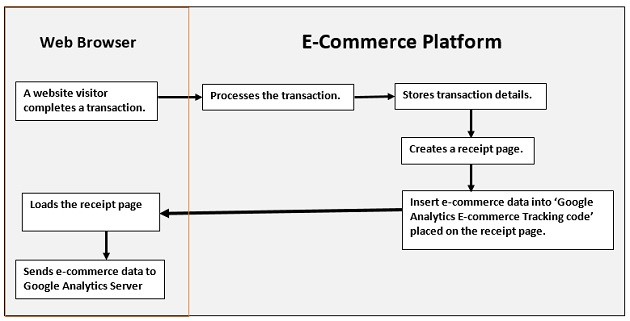
    How e-commerce Tracking Works?

    e-commerce_trackingImage Source

    1. A website visitor completes a transaction.
    2. Your e-commerce platform:
    • processes the transaction (verify credit card details etc)
    • stores transaction details
    • creates a receipt page (generally ‘thank you’ page)
    • inserts e-commerce data into ‘Google Analytics e-commerce tracking code
    • sends receipt page to the visitor’s web browser
    1. As soon as the page is loaded into the visitor’s browser, the Google Analytics e-commerce tracking code is executed and sends the e-commerce data to the Google Analytics server.


    How to Set up e-commerce Tracking in Google Analytics

    Step 1: To activate e-commerce tracking

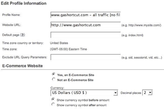
    You must first enable e-commerce reports. Log into GA and edit the profile settings. To activate the e-commerce reports, specify that your site is an e-commerce site.

    activate_trackingImage Source

    Unless you have an international site, you won’t find much use for the other e-commerce settings. For example, you can specify one of 25 different currencies and the number of decimal places you want displayed. Even if you use USD you can specify 3 decimal places. By Default, e-commerce tracking is set to “off”. In order to track a transaction on GA activate e-commerce tracking at a profile level.

    Step 2: Tag your receipt page

    Make sure you add the GA tracking code on your receipt page. The e-commerce tracking code is stored in the ga.js and if this file is not included on the receipt page you can’t track transactions.

    Step 3: Install the code

    Code construction: the hard part. GA uses a JavaScript collection technique to track e-commerce transactions. Your server code must inject transaction information into the GA JavaScript before sending the receipt page back to the browser. When the receipt page renders in the visitor’s browser the JavaScript executes and sends the transaction info to GA.

    code_constructionImage Source

    Here’s the code:

    < script type=”text/javascript” >
    pageTracker._addTrans(
    “order-id”, // required
    “affiliate or store name”,
    “total”,
    “tax”,
    “shipping”,
    “city”,
    “state”,
    “country”
    );
    pageTracker._addItem(
    “order-id”, // required
    “SKU”,
    “product name”,
    “product category”,
    “unit price”, // required
    “quantity” //required
    );
    pageTracker._trackTrans();
    < /script >

    There are three distinct parts to the JavaScript, and each is a different method. The first section, identified by the _addTrans() method, creates the transaction and stores all the information about the transaction. The second section, identified by the _addItem() method, is used to add an item to the transaction. You need to create an_addItem() section for each separate item, or SKU, in the transaction. The order ID in the _addItem() method must be the same order ID used in the _addTrans() method. That’s how GA ties an item to a transaction. The final section, the _trackTrans() method, sends the data to GA by requesting the __utm.gif file once for the transaction and once for each item in the transaction. So if you have 3 different SKUs in a transaction there will be 4 requests for the __utm.gif.

    The JavaScript shown above can appear anywhere on your receipt page. But make sure that it appears after the main GA page tag because the e-commerce code is part of the pageTracker object. Just to reiterate a point: you must create server side code that outputs the transaction data in the above format. If you do not have access to your shopping cart code, and if your cart provider does not provide e-commerce tracking, you may be out of luck.

    Once the code has been installed you should begin to see e-commerce data in your GA.

    What Data can be Tracked?

    Google Analytics collects two types of e-commerce data: transaction data and item data. Transaction data describes the overall transaction (transaction ID, total sales, tax, shipping, etc.) while item data describes the items purchased in the transaction (sku, description, category, etc.). All of this data eventually ends up in GA reports.

    The complete list of data includes:

     Transaction Data

    • Transaction ID: your internal transaction ID [required]
    • Affiliate or store name
    • Total
    • Tax
    • Shipping
    • City
    • State or region
    • Country

    Item Data

    • Transaction ID: same as in transaction data [required]
    • SKU
    • Product name
    • Product category or product variation
    • Unit price [required]
    • Quantity [required]

    A few notes about the data:

    • Geo-location data is no longer used by Google Analytics. The new version of GA identifies where the buyer is located using an IP address lookup.
    • You should avoid using any non-alpha numeric characters in the data, especially in the numeric fields.
    • Do not add a currency identifiers (i.e. dollar sign) in the total, tax or shipping fields. This can cause problems with the data.

    Contact us to learn more about how analytics can improve your business.

  • Black Friday [Infographic]

    The Thanksgiving feast is over and the turkey, sweet potato and cranberry sauce is long gone. After the feast and celebrations comes America’s busiest shopping day – Black Friday. Sales just under $27 billion in 2005 have skyrocketed to $61.4 billion in 2013.

    Tectonic shifts are happening all around us in the way people are shopping. People’s penchant to shop online via their tablets and smartphones will be fully manifested this holiday shopping season. The biggest shopping extravaganza of the year is underway and the online world is abuzz with staggering deals. Go through this discerning infographic to learn more on how trends have shifted to online shopping via smart phones and tablets.

    Black Friday infographic

  • Apple iAd Expands into Programmatic Buying

    The programmatic buying bug has bitten brand Apple too. The iAd mobile advertising platform developed by Apple has finally gone the programmatic way. This platform is one of the biggest mobile ad platforms with tens of thousands of advertisers bidding on the available mobile inventory to promote their brands and businesses alike. So it was only natural that Apple resorted to programmatic buying in order to improve the speed and efficiency of the ad bidding process.

    iAd will now make more than 250,000 apps across its platform in over 100 countries accessible to the DSPs (Demand-side Platforms) and ad tech firms like MediaMath, The Trade Desk, Rubicon Project, GET IT Mobile, Accordant Media, Adelphic and AdRoll. These are just a few of the launch partner names. The network is going to expand rapidly in the days to come.

    Programmatic is the way to go when it comes to ad bidding since it reduces redundancy and improves overall efficacy of the process. Mobile is the dominant platform for advertisers to reach out to the young and aspiring demographics in any country. Apps have a preponderance over other forms of content consumption on the mobile platform. Apple brings with it phenomenal scale, high quality user experience and a unique, rich data set. This has got the advertisers quite excited.

    Key Takeaway for Digital Marketers

    With each passing day, more and more online processes are getting automatized. The ad bidding process if done manually is too cumbersome, especially if you are going to bid for tens of hundreds of ad spots and that too on a regular basis. Programmatic can help you make sense of what actually is offered to you and what are your options regarding the various ad inventories available. To learn more about the advantages of programmatic buying of ad inventory over traditional forms of buying ads, please visit the link here.

    With its move into programmatic buying, Apple has released an updated API for its automated buying platform the iAd Workbench. This new API allows the advertising fraternity to generate campaigns, make updates, access analytics and optimize bids seamlessly via their own systems. Learn more about it now at iAd Workbench API Guide.

    Has this new move from Apple got you all excited? Well, we can’t hide our excitement!

    Contact us now to get started with programmatic buying on the Apple iAd platform.

  • Apple iAd Offers Retargeting Sans Cookies

    Apple, a company that revolutionized cutting-edge gadgets is now trying to get a foothold in the lucrative mobile ads market that was hitherto dominated by industry giants like Google and Facebook. With the re-launch of iAd (Apple’s mobile ad platform), advertisers can now better target audience across the iOS mobile platform letting them have a shot at a bigger customer base. Apple for long was actively striving for cross-device ad serving and retargeting via the iAd platform without much influence. But this renewed attempt from Apple will help open the floodgates for advertising agencies cutting across industry sectors like retail, game developers, travel apps and a lot more. Thus, whenever a user is exposed to a certain ad, he/she can be tracked across the iOS platform in order to make the maximum impact.

    Apple has added audience retargeting capabilities to its mobile ad platform iAd on iOS 8. This means that digital marketers can now follow their customers across different apps and also various websites on iPhones & iPads. This way the customers will feel a greater sense of connection with the brand as advertisers make a renewed attempt at reaching out to them.

    Since cookies don’t work on mobile devices, Apple had to create a roundabout way in order to target the mobile users. They achieved this using the universal Apple Id that gives access to iTunes, iCloud, iMessage and all things Apple. This way digital marketers targeting Apple customers can get a detailed report of all the users on the mobile iOS platform helping them understand quirky user behavior to serve tailor-made ads.

    Using the Apple iOS platform you can create audience segmentation which will get updated automatically and thus you will see that you can target people in a certain segment using a unified strategy since there is a semblance of a single unit here. Now digital marketers can improve their ROI as they can send personalized messages to users depending on their past interactions with the iOS platform. Apple users spend a majority of their time on connected devices engrossed within apps. Hence no digital marketer can afford to lose such a big opportunity.

    If a particular user is at a certain level of a game he/she could be sent a targeted ad in order to encourage him/her to upgrade to the next level. If some user has abandoned an app then he/she could be encouraged to revisit that app. Thus the opportunities are many and Apple is just beginning to experiment with this new idea of tracking customers on their mobile devices where cookies seem ineffectual.

    Apple has been a late entrant in the mobile ad space or any ad space for that matter. But it is definitely hoping to take giant strides with the iAd upgrade. Looking at Apple’s history of triumphing at almost everything that it has undertaken in the recent past, it is just a matter of time before it succeeds in this venture too.

    If you are a digital marketer excited about this new advertising opportunity and would want to leverage it for your brand then please get in touch with us by clicking here.

  • Facebook “Like” Button goes Mobile

    Facebook has come up with yet another update wherein the ubiquitous “Like” button will now be available for Android and iOS mobile apps too. This has got the digital marketers quite excited since now they can analyze user engagement via mobile apps. The mobile users can directly “Like” the app’s Facebook page or any other object within the app and share it on the social networking site.

    Today more and more people are using mobile gadgets like smart phones, tablets and phablets (phone + tablet) as their primary device for browsing the Internet. In the world of mobile devices the apps rule supreme. So any marketing strategy that does not take into consideration this vital factor is doomed to fail. The Facebook “Like” button going mobile in order to garner the attention of the growing clan of app users is a well-timed update from the social media giant.

    The “Like” button works flawlessly with the user’s Facebook account no matter what device he/she is using to log into the account. This makes liking any piece of content in the native app effortless. Facebook has issued some guidelines for digital marketers in order to make the most of the Like button on mobile apps. They are as follows:

    • Research when exactly to show the Like button.
    • Position it strategically to get the best outcome.
    • Have a riveting Facebook page.

    As a digital market you have data of a whole new segment of consumers using mobile apps, at your disposal. Using the “Like” button you can find out which is the form factor that your customers are most comfortable with and how it converts into more marketing leads. This can give you an accurate picture about which platform is the most profitable. Thus you can pursue a digital marketing strategy taking cue from this new found knowledge.

    Mobile marketing will upend the digital marketing world for good. So you have to be always nimble and on the lookout for new opportunities and threats alike. You need to have a team of technologists with an intuition of future technology, business executives with an eye on the revenues working together seamlessly. Their efforts can then come to fruition using market intelligence apprising you about imminent business prospects.

    It was but imperative on the part of Facebook to bring an update like this since the majority of Facebook users are youngsters. So keeping in sync with the mobile centric demographics that Facebook has, it had to bring its desktop features and capabilities on to the mobile bandwagon thus benefiting publishers and developers on this burgeoning platform.

    So how do you think this new update from Facebook, is going to augment your digital marketing campaign going forward?

  • Take Your Mobile App Marketing Campaigns to the Next Level with Deep Linking

    What separates a successful mobile app from an unsuccessful one? Design, ease of use, demand, effectiveness, etc. all play their part.

    The truth is, however, that effective marketing can make a huge difference between an app that is a commercial success and one that gets lost amongst the ever burgeoning crowd of daily released apps.

    In addition to putting some marketing effort behind you app’s promotion, it’s incredible how many app developers and marketers aren’t aware of capabilities of mobile app such as what mobile deep linking is, never mind how to use it to benefit their marketing campaigns.

    Let’s take a quick look at a few steps you can take to significantly enhance the success of your app through smarter marketing with deep links.

    What is Mobile App Deep Linking?

    Mobile app deep links in search results allows users to click links to view specific content within your app, or download your app, depending on if they have your app installed. If a person doesn’t have your app installed and clicks on a deep link, they will automatically be directed to your app’s page in the App Store so they can download your app before proceeding to your deep link landing page within an app.

    If a person doesn’t have the app installed and clicks on a deep link, they will automatically be directed to the app’s page in the App Store so the user can download the app before proceeding to the deep link destination. Deep linking helps simplify the conversion friction by shortening the users’ flow to the piece of content, product or promo they are interested in which convince user to a buyer.

    Mobile App Deep Linking

    Image source

    How deep link works?

    Allowing your mobile app to be launched via a link is a necessary first step to making it accessible from the web. This enables promotional efforts (email, social posts, ads, etc.) to lead users directly into your mobile app which is typically a better and more seamless experience for your customers.

    If your mobile app is already set up to handle a URI, you are ready to create optimized links that detect if the app is present on a user’s device and then takes them to the mobile app content they are looking for!

    What is URI?

    In short, a URI is really just a link. The most common kind is a web link (http://www.google.com) which when clicked instructs the browser to render a web page. A mobile app URI is another type of link that allows a user to launch an app—not just a browser—when clicked; for example, youtube:dQw4w9WgXcQ will bring up a video in the YouTube app if it is installed. On both iOS and Android, any mobile app can indicate that it handles URIs, and for this reason, URIs are an ideal mechanism by which mobile apps can be launched from the web.

    Benefit from deep linking?

    For apps such as shopping, travel, hotel booking, music and news the ability to send users to a specific product, offer or promo page can have tremendous effect over conversion rates and ultimately revenues. For example, if deep linking is enabled, the user can be navigated directly to a certain hotel booking page for which he has seen an advertisement instead of the app’s home page.

    Does deep linking works only for users that have the app already installed? Not true.

    Deep linking benefits both pre-installed and new users. There are programs that can carry forward the saved request. If the user doesn’t have the app installed, he/she is sent to the App store and, upon opening the app after the installation, is directly taken to the deep linked page for the user requested content.

    Even though deep linking is only used as a re-engagement mechanism to bring users back inside the app, it has an enormous potential to drive conversions and ROI.

    Why Mobile Deep Linking Important?

    Deep linking helps every mobile app which has multiple screens, products or sections to offer for the interested customer. This means that instead of making every user open your app’s main screen and then manually navigate, deep links can take them directly to the desired page.

    There are a number of reasons why mobile deep linking is incredibly important.

    Deep linking:

    • Allows you to highlight areas of your app which do not get lot traffic. With deep links you can easily point to specific areas of you app that you want to highlight and “refresh.”
    • Allows you to enhance the flow of your app, encouraging users to engage and view specific content. This could be anything from media content to new subsequent products offered by yourself or affiliates.
    • It also allows you to exponentially increase the revenue. By encouraging visitors to engage with, and view other sections within your app, you will be able to align ads with the most relevant content, significantly increasing the conversion rate.
    • Allows your app to be more discoverable. Since Google now indexes deep links within apps, more of your content can be found from user queries with the search engine.
    • Helps drive re-engagement. For example, a retail company can notify existing customers about the current promotion and drive interested users directly to the product page. It’s time to think beyond the install and start driving value post download!
    • Improves the experience of your cross channel marketing campaigns. You can use a deep link for the destination of your promotions across email, social, third parties and your website.
    • Removes several layers in the conversion funnel. When users don’t have to navigate through your app to get to the offer or intended destination, you’ll likely lose fewer users through the conversion funnel.
    • Helps you understand cross-channel measurement. With the ability to track and measure user experience with deep links, marketers will have a better understanding of how mobile fits into the buying path and the gain insight into the full impact of mobile in their marketing strategy.

    Effective Way of Optimizing Mobile App Deep Linking

    Google also provided a list of best practices to consider when adding deep links to your app:

    • Identify the URI of the section to be linked is most critical – Publishers must specify app deep links for their homepages, or else the links won’t show up.
    • App deep links should only be included for canonical web URLs.
    • Not all website URLs in a Sitemap need to have a corresponding app deep link. Do not include app deep links that aren’t supported by your app.
    • If you are a news site and use News Sitemaps, be sure to include your deep link annotations in the News Sitemaps, as well as your general Sitemaps.
    • Don’t provide annotations for deep links that execute native ARM code. This enables app indexing to work for all platforms.
    • Make sure the back button behavior of your app leads directly back to the search results page.

     Mobile deep linking the future

    Mobile web use has been declining, while mobile app use continues to spike, now occupying 86% of the average US mobile consumer’s time. If deep links weren’t a part of your mobile engagement strategy before, it’s time to consider adding them. As mobile app use rises, deep links gain traction. Right now, they make for better app discovery, engagement and conversion with richer opportunities. In the future, when deep links are adopted at scale, they will make navigating between apps similar to how we navigate between web browsers, with more fluid pathways.

    Blog contributed by Rajkumar Raju, Assistant Manager-SEO, Position2 Inc.