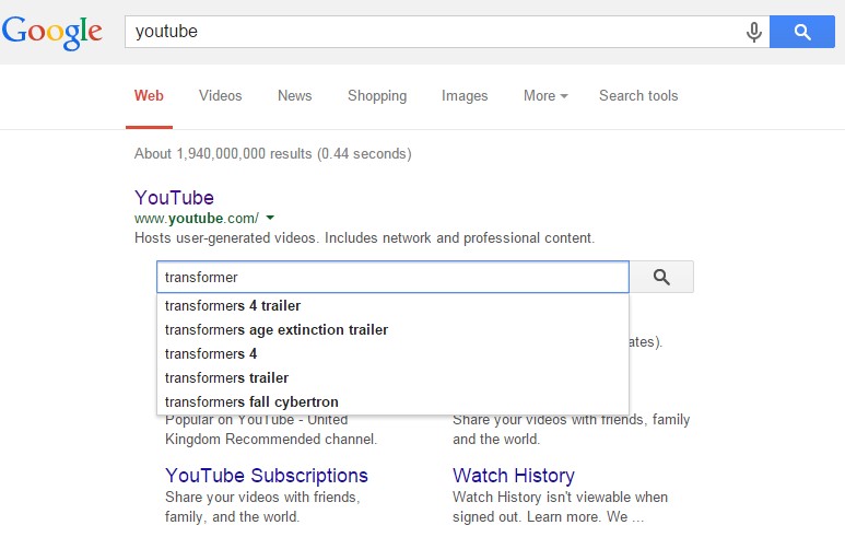
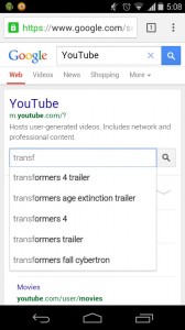
The use of mobile devices with differing display sizes to browse the web has all but erupted overnight, and most websites haven’t been optimized to handle the variety of screens. Enter Responsive Web Design (RWD), a technique capable of rendering the same content without disruption across devices with varying screen sizes.
What is Responsive Web Design?
Responsive web design is a web development approach that enables dynamic changes to the appearance of a web page, depending on the screen size and orientation of the device used. It’s a technique for building websites that works on mobile phones, tablets, TVs, game consoles and wearables as well as laptops and PCs. RWD is the best way for websites to eloquently adapt to different kinds of screens.
How does Responsive Design work?
With RWD web pages automatically adapt to the layout of the viewing environment using Fluid, proportions-based grids, Flexible or responsive images and Media queries.
Fluid Grid:
Website design initially followed in the tradition of the print media industry where a magazine or newspaper was the same fixed size, though in the case of websites the size was defined in terms of pixels. But the problem arises when website content is no longer viewed using only one fixed display size. A magazine is a magazine and the content is universally viewed in a specific fixed size. Websites can be viewed using a bigger format like a television or a smaller format like a smartphone, or a tablet or an even smaller smart watch. So, responsive web design builds websites with relative, not fixed units. The fluid grid concept calls for page element sizing to be in relative units like percentages, rather than absolute units like pixels or points.
Flexible or Responsive Images:
The idea of responsive images, in a nutshell: images shrink and adjust themselves within the confines of a fluid grid.
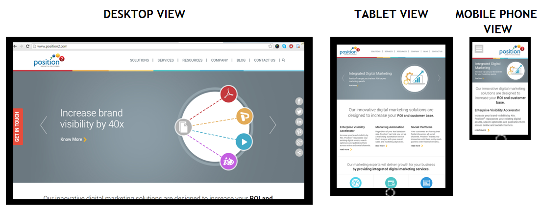
Home page of www.position2.com viewed on various devices
Desktop View gives maximum image size, but in the Tablet View the same image shrinks to display with full details while text content colonizes the remaining area of the screen. In Mobile Phone View, the image shrinks to display full details and text content occupies the remaining area of the screen. So, depending on the screen size, responsive images shrink or extend to display images in full details.
RWD developers define the maximum and minimum dimensions to establish the limit of image pixilation in the CSS.
img { max-width: 100%; }
Media Queries:
Websites are usually built for viewing on desktops and laptops in landscape mode. It’s challenging to take such a website and try to shrink it down to a mobile phone because mobile phones are used in portrait mode where the screen is longer than it is wide. With the website scrolling vertically, layouts several columns wide don’t work. This is where media queries come in. Media queries are a CSS technology, a core component of responsive design. Media queries allow CSS to be applied only when specific conditions are met (like when a webpage is viewed in portrait mode). When a design is too large or too small, a media query detects the site width and serves CSS that appropriately rearranges or adjusts the site’s content.
Media queries code differs depending on the target device. Below is an example of media queries code for a smart phone in portrait mode:
<style type=”text/css”>
@media (max-width: 320px) {
#banner { width:275px; }
#banner img { max-width:275px; max-height:83px; }
#main { width:250px; }
#main-content { width:250px;padding:0px;}
#widget-container { width:250px; padding:0px; }
.widget-content { width:250px; margin:5px;}
.widget-text { display:none; }
}
</style>
The challenge in responsive web design is to reorganize elements on larger pages to fit smaller, longer pages or vice versa. To make sure responsive design is successful, the design must be usable across an array of screen sizes (SEO experts will help the developer to define this limit based on the various devices used to access the website from Google Analytics).
Advantages of Responsive Web Design
A website with responsive web design gives a better user experience and the users are more likely to engage with the content.
Cost efficient: When a website is developed using responsive web design, it basically means one website for all screen sizes and devices. You won’t have to build a separate mobile website.
Smarter and better user experience: RWD gives users a better experience by offering the same content on a smaller device. It can be accessed from anywhere on any device at the sole discretion of the user.
Future preparation: If you have a website built with responsive web design, then you are well prepared for the mobile future.
Increase in conversion rate: A well-optimized website gives better user experience, encourages them to remain engaged with the site, and eventually leads them to customer conversion.
One URL for one website: One website with a common URL can be used for different devices.
Better user experience: Responsive websites are available to users anytime anywhere on any device.
Bounce rate improvement: Do not underestimate the fickle nature of tablet and mobile users. They want their (same) desktop content and they want it now, otherwise they will bounce. And those bounce rates can get high. RWD enables delivery of the same content both in mobile and desktop view thus improving mobile traffic.
Responsive web design delivers great user experience. It’s simply the best way to optimize a website for mobile devices. Visitors accustomed to viewing websites on larger screens expect the same experience on their smaller devices. If a website is not well optimized, then it annoys the user and bounce rates escalate. The solution is a responsive website with well optimized content ensuring that users see what they really want to see at first glance.
Contact us now to deploy responsive web design & never miss another opportunity!