Tag: css

  • Responsive Web Design (RWD) – What you should know?

    The use of mobile devices with differing display sizes to browse the web has all but erupted overnight, and most websites haven’t been optimized to handle the variety of screens. Enter Responsive Web Design (RWD), a technique capable of rendering the same content without disruption across devices with varying screen sizes.

    What is Responsive Web Design?

    Responsive web design is a web development approach that enables dynamic changes to the appearance of a web page, depending on the screen size and orientation of the device used. It’s a technique for building websites that works on mobile phones, tablets, TVs, game consoles and wearables as well as laptops and PCs. RWD is the best way for websites to eloquently adapt to different kinds of screens.

    How does Responsive Design work?

    With RWD web pages automatically adapt to the layout of the viewing environment using Fluid, proportions-based grids, Flexible or responsive images and Media queries.

    Fluid Grid:

    Website design initially followed in the tradition of the print media industry where a magazine or newspaper was the same fixed size, though in the case of websites the size was defined in terms of pixels. But the problem arises when website content is no longer viewed using only one fixed display size. A magazine is a magazine and the content is universally viewed in a specific fixed size. Websites can be viewed using a bigger format like a television or a smaller format like a smartphone, or a tablet or an even smaller smart watch. So, responsive web design builds websites with relative, not fixed units. The fluid grid concept calls for page element sizing to be in relative units like percentages, rather than absolute units like pixels or points.

    Flexible or Responsive Images:

    The idea of responsive images, in a nutshell: images shrink and adjust themselves within the confines of a fluid grid.
    Responsive_website_device_view

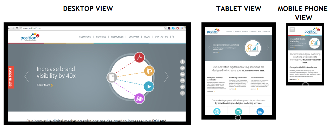
    Home page of www.position2.com viewed on various devices

    Desktop View gives maximum image size, but in the Tablet View the same image shrinks to display with full details while text content colonizes the remaining area of the screen. In Mobile Phone View, the image shrinks to display full details and text content occupies the remaining area of the screen. So, depending on the screen size, responsive images shrink or extend to display images in full details.

    RWD developers define the maximum and minimum dimensions to establish the limit of image pixilation in the CSS.

    img { max-width: 100%; }

    Media Queries:

    Websites are usually built for viewing on desktops and laptops in landscape mode. It’s challenging to take such a website and try to shrink it down to a mobile phone because mobile phones are used in portrait mode where the screen is longer than it is wide. With the website scrolling vertically, layouts several columns wide don’t work. This is where media queries come in. Media queries are a CSS technology, a core component of responsive design. Media queries allow CSS to be applied only when specific conditions are met (like when a webpage is viewed in portrait mode). When a design is too large or too small, a media query detects the site width and serves CSS that appropriately rearranges or adjusts the site’s content.

    Media queries code differs depending on the target device. Below is an example of media queries code for a smart phone in portrait mode:

    <style  type=”text/css”>

    @media (max-width: 320px) {
    #banner { width:275px; }
    #banner img { max-width:275px; max-height:83px; }
    #main { width:250px; }
    #main-content { width:250px;padding:0px;}
    #widget-container { width:250px; padding:0px; }
    .widget-content { width:250px; margin:5px;}
    .widget-text { display:none; }
    }
    </style>

    The challenge in responsive web design is to reorganize elements on larger pages to fit smaller, longer pages or vice versa. To make sure responsive design is successful, the design must be usable across an array of screen sizes (SEO experts will help the developer to define this limit based on the various devices used to access the website from Google Analytics).

    Advantages of Responsive Web Design

    A website with responsive web design gives a better user experience and the users are more likely to engage with the content.

    Cost efficient: When a website is developed using responsive web design, it basically means one website for all screen sizes and devices. You won’t have to build a separate mobile website.

    Smarter and better user experience: RWD gives users a better experience by offering the same content on a smaller device. It can be accessed from anywhere on any device at the sole discretion of the user.

    Future preparation: If you have a website built with responsive web design, then you are well prepared for the mobile future.

    Increase in conversion rate: A well-optimized website gives better user experience, encourages them to remain engaged with the site, and eventually leads them to customer conversion.

    One URL for one website: One website with a common URL can be used for different devices.

    Better user experience: Responsive websites are available to users anytime anywhere on any device.

    Bounce rate improvement: Do not underestimate the fickle nature of tablet and mobile users. They want their (same) desktop content and they want it now, otherwise they will bounce. And those bounce rates can get high. RWD enables delivery of the same content both in mobile and desktop view thus improving mobile traffic.

    Responsive web design delivers great user experience. It’s simply the best way to optimize a website for mobile devices. Visitors accustomed to viewing websites on larger screens expect the same experience on their smaller devices. If a website is not well optimized, then it annoys the user and bounce rates escalate. The solution is a responsive website with well optimized content ensuring that users see what they really want to see at first glance.

    Contact us now to deploy responsive web design & never miss another opportunity!

  • Ten Ways to Optimize Website Speed

    After quality content, page speed is the most important website feature. But all too often people think that optimizing website speed at the time they create a website or blog is wasted effort. They couldn’t be any more wrong. As the popularity of your website expands, testing for page speed becomes absolutely imperative.

    WHY WEBSITE SPEED?

    In a word, search engine rankings.While optimized website speed is important from a user’s perspective, search engines reward it with higher rankings because speed is critical for robots scanning a website. If a competitor’s website loads faster than yours it will take a better position ahead of you on the  search engine results page. The performance of a website is important, but so too is increasing website load time speed. Regularly monitor your website load time and take necessary measures to increase the site speed.

    Website_Speed

    BEST SEO TIPS TO OPTIMIZE THE WEBSITE SPEED


    1. Minimize HTTP Requests

    According to Yahoo, 85% of web page load time is spent downloading the different components of the page (e.g. images, style sheets, and scripts). An HTTP request is multiplied when there are duplicate scripts in the code. Identify and remove these duplicate scripts.

    The quickest way to improve site speed is to simplify your design.

    • Use CSS scripts to combine multiple images
    • Combine background images into a single image
    • Combine multiple style sheets into one
    • Use Script tag on your HTML page
    • Reduce scripts
    1. Optimize Image Size

    Images often contain additional comments and use unnecessary colors. Make images as small as possible so that the browser does not have to resize them.

    Use image editing tools to:

    • Crop your images to the correct size
    • Save in JPEG format
    • Reduce color depth to the lowest acceptable level
    • Remove image comments
    • Specify image dimensions
    1. Minify Resources

    Minification, the process of removing all unnecessary characters from source code without changing its functionality, helps to reduce its size and improve load time.

    Eliminate extra spaces, line breaks, and indentation in your code to keep your pages as lean as possible.

    Minification tools available online include:

    • To minify HTML, PageSpeed Insights Chrome Extension (generates an optimized version of your HTML code)
    • To minify CSS, YUI Compressor
    • To minify JavaScript, JSMin , YUI Compressor
    1. Add CSS at the top and JS at the bottom

    Your pages load faster with style sheet references added to the head of your HTML document because it allows the pages to gradually render the styles. Style sheets also improve page load time.

    Browsers can only download two components per hostname at any given time. Adding your scripts towards the top blocks everything below during the initial page load, and gives the impression of the page loading slower.

    To avoid this situation, place your style sheet at the beginning or <Head>of the HTML document and scripts references at the end, right before closing the <Body> tag.

    1. Caching your web pages

    When you visit a web page for the first time, your browser requests all the web page image files, CSS Scripts and Java files to load from the website’s server, taking up precious page load time.  Caching your website saves these file resources to the browser, and the files can be retrieved from the cached files rather than downloading them again from the network.

    1. Install a cache plugin

    Caching plugins permit you to publish static rather than dynamic HTML files, reducing the time a page takes to load. Additional caching features include minification, caching of feeds, Gzipping, and Content Delivery Network (CDN) support.

    1. Compress and optimize your content

    Compressing your website content will have a huge impact on reducing load times. Large pages with recurring high-quality content are slow to download. The best way to speed up the load time is to zip the pages, called compression. This saves bandwidth as well as the download time it takes to  view your website. It’s biggest impact is on web page load time. Be sure to configure the server to return zipped content.

    You can also compress and optimize your CSS and JavaScript files by combining them and minifying the source code.

    1. Reduce 301 redirects

    Avoiding redirects increases serving speed. Every time a 301 redirect is used, it forces the browser to a new URL which increases page-loading time. The solution? Check for broken links and fix them immediately.

    1. Reduce the number of unnecessary plugins

    A site that needs plugins may slow your web page loading speed.  Too many plugins create safety issues, and often cause crashes.

    Try to measure server performance after disabling the plugins. This way you can identify any plugins that hamper your site speed.

    Web page speed is a metric that should not be ignored if you are concerned about providing  the best user  experience. You can examine and check website speed through free services like Google Site Speed Test and Pingdom.

    1. Avoid text graphics

    Some sites may need formal text to make the web page look attractive. However, text in the form of an image takes up a lot of the web page size and is of no SEO benefit. Don’t use text styles in CSS and keep everything in text format in its place.

    Take Away

    Optimizing your website loading speed is an essential task because search engines reward fast loading websites. Hopefully, these best practices will be of some help. What has or hasn’t worked for you? We would love to know. Contact us now to optimize your website!

  • Bing Crawls Non-responsive Mobile Sites

    The search engine Bing from the Microsoft Stable is going to affect the fledgling mobile SEO market in a more impactful way. Bing has launched a new set of mobile crawlers with BingBot Mobile User Agents in order to index mobile sites better and to offer more optimized results on the mobile platform.

    Bing recommends all webmasters to design responsive sites but unfortunately not everyone follows these recommendations. Hence Bing had to come up with a way to overcome the hurdle and give searchers a better mobile experience. Bing checks if your website is mobile compatible with this new set of mobile crawlers and offers the most optimized sites in the Bing mobile search results.

    That way Bing can differentiate how your website is viewed on the iPhone as compared to the Android platform or the desktop browser. Bing needs unrestricted access to your JavaScript and CSS files for better mobile optimization.

    This is good news to all digital marketers who had non-responsive albeit high quality mobile sites, since now their websites can rank higher in mobile search results too. If your site is mobile optimized then you can reap rich dividends courtesy of this new update from Bing.

  • Google Updates Technical Webmaster Guidelines

    The Googlebot that crawls all the web pages could until now only understand textual content and not image based content, CSS or JavaScript. But all that is going to change now, thanks to a recent Update to Google Webmaster Guidelines. Now you will have to optimize your site not just with respect to the textual content but also with respect to the images and the JavaScript too. You will have to do extensive optimization for your CSS (Cascading Style Sheets) too because the Google Spiders will now recognize them.

    If your website settings are such that your robots.txt file is preventing the Googlebot from accessing your Java files then you are at a loss and Google advises you to render access to the bots.  The Google Panda algorithm will negatively view your content if it is not up to the mark with respect to JavaScript or CSS file.

    If in case you are not sure JavaScript and CSS is getting indexed or not, then you can do a manual check by the following process.

    Google fetch

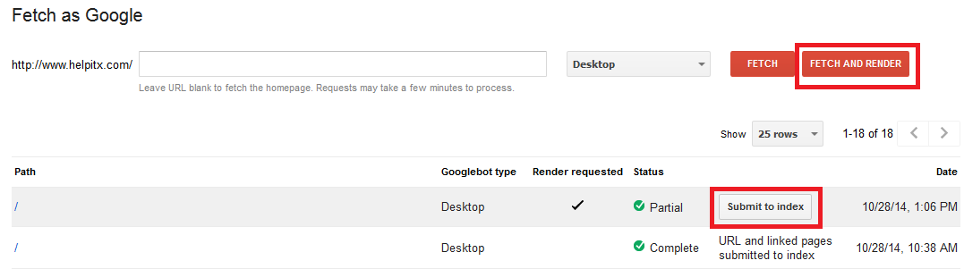
    You need to first select Fetch option under the Crawl tools and then you need to enter the URL of the site that you want to check. If you want to test the homepage then you need to leave the field blank. Press Fetch and Render button so that the Googlebot will begin to crawl your website. Once the crawling is complete you can press the Submit to index button to see the detailed results of the indexing.

    Previously Google used to advise webmasters to check their content on text only browsers like Lynx but now with this new update you will have to check the content on regular browsers to see to it that the site is optimized keeping the new Google update in mind.

    Google offers the following advice for optimal indexing of your website.

    • Be sure to use only the most popular technologies on your website that support the maximum number of browsers.
    • Speed is an important factor for the Google indexing hence avoid all roadblocks to swift indexing like large downloads, et al.
    • Club your various CSS and JavaScript files together and also compress them for better and easier indexing.
    • Handling of full JavaScript and CSS can be tough at times due to various issues and hence optimize your website so that all these additional formatting styles are easily indexed at all times.

    Let us know how this new Update from Google will affect your SEO efforts, going forward.